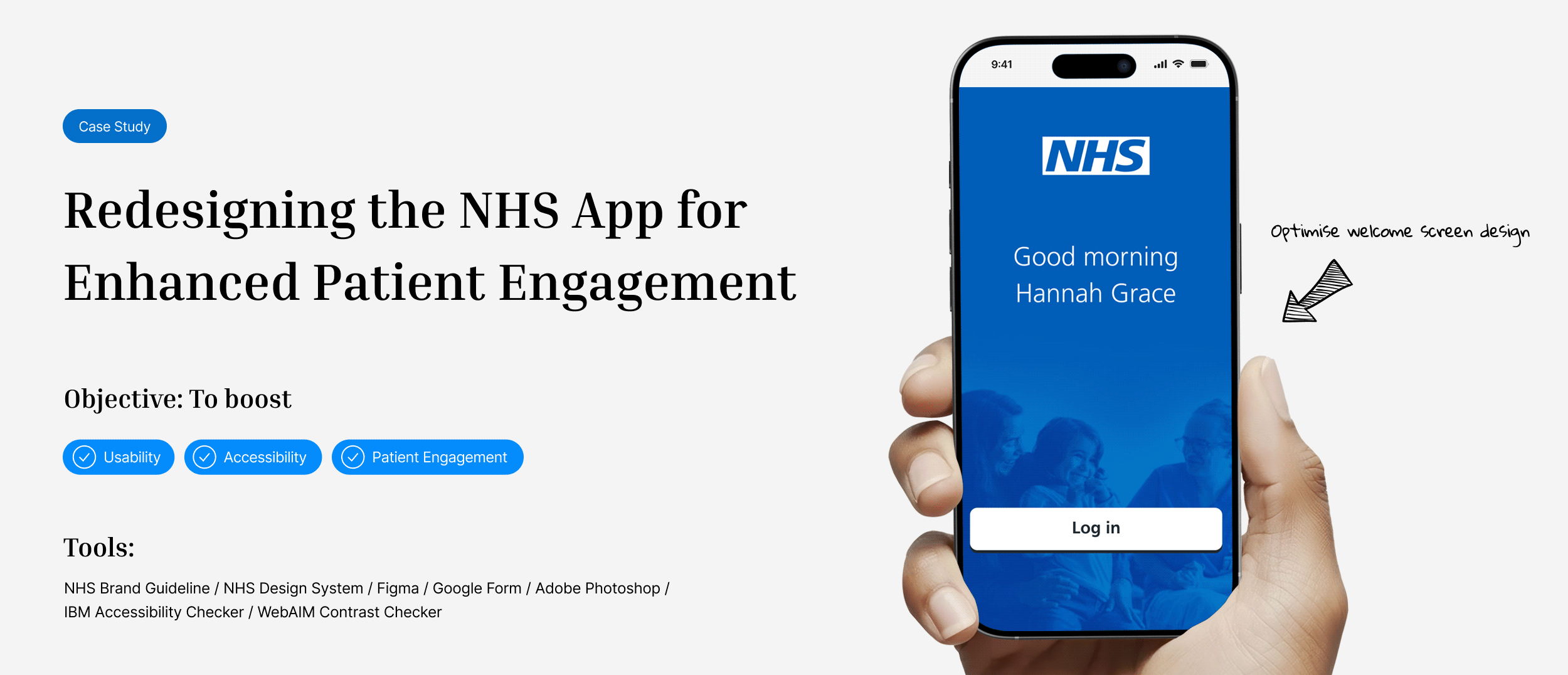
Despite being the UK's primary digital healthcare tool and continuous 'digital-first' efforts since 2019, the NHS mobile app struggles with low user satisfaction, averaging just 3.1 out of 5 on the App Store in 2025. This project aimed to address critical gaps in Usability, Accessibility, and particularly, Patient Engagement.
DEFINING THE CHALLENGE
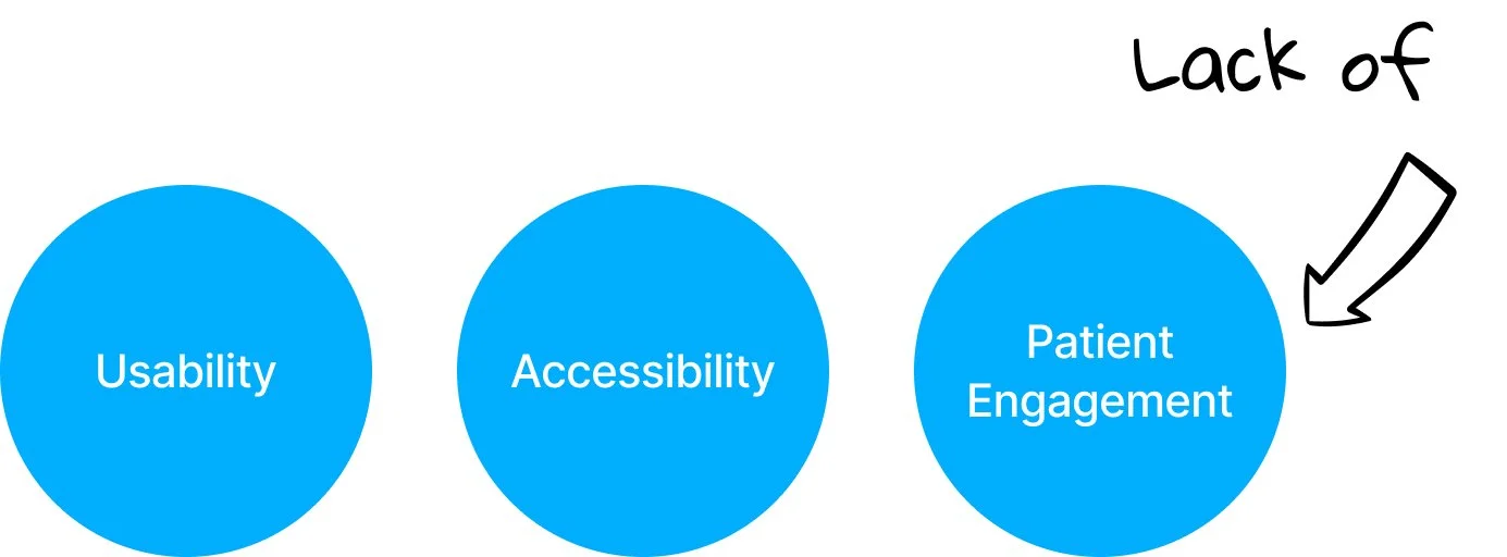
Why are users still dissatisfied with the NHS App?
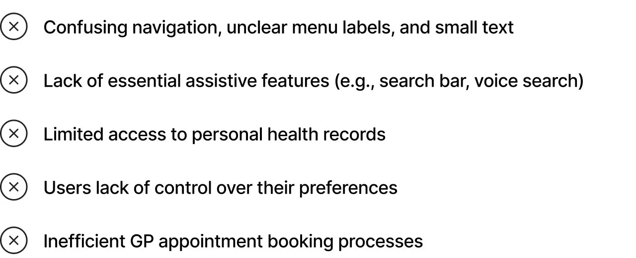
My research, including an online survey, MAUQ framework evaluation, reviews of relevant paper and online NHS reports, and app observations, uncovered several core issues contributing to user dissatisfaction.
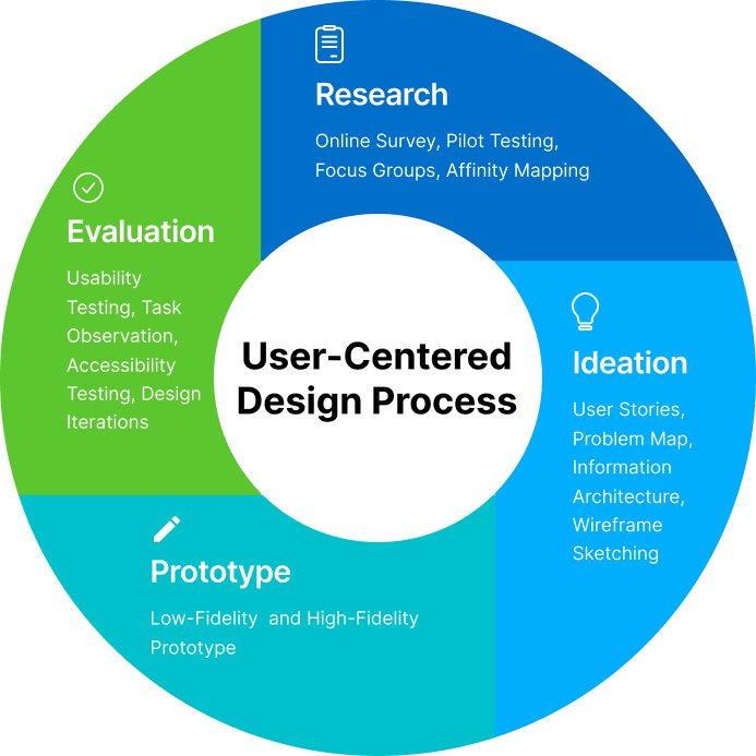
My SOLUTION APPROACH: USER-CENTERED PROCESS + EMOTIONAL DESIGN
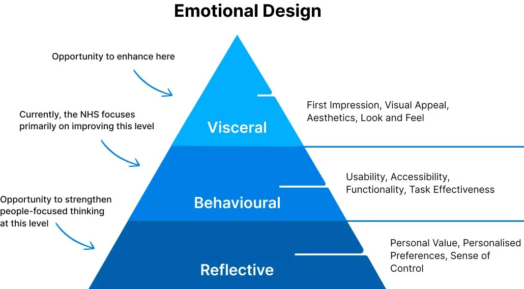
To elevate patient engagement within the NHS app, I integrated a 3 level emotional design framework into a comprehensive User-Centered Design (UCD) process: Research, Ideation, Prototyping, and Evaluation. This approach allowed for a holistic understanding of user needs, from foundational functionality to intuitive interaction and personalised experiences.
RESEARCH: MAUQ & QUALITATIVE
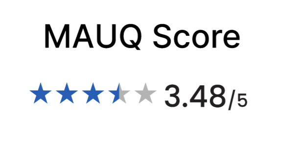
To identify key user challenges and opportunities within the NHS app, I spearheaded comprehensive user research, beginning with the design and deployment of an online survey. This included a mHealth App Usability Questionnaire (MAUQ), utilising a 5-point Likert scale to assess ease of use, system efficiency, and user satisfaction. Complementary open-ended questions gathered qualitative insights.
The MAUQ results primarily indicated the following:
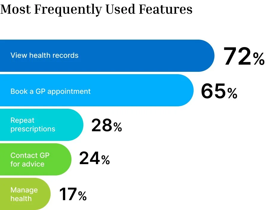
Users frequently struggled to access certain features and locate information, pointing to a need for enhanced information architecture.
The “Interface Appealing” dimension received the lowest average score, clearly indicating user dissatisfaction with the app’s interface and interaction design.
RESEARCH INSIGHTS: UNDERSTANDING USER NEEDS & EXPECTATIONS
The online surveys identified that users primarily rely on the NHS app for essential services: viewing health records, booking GP appointments, and requesting repeat prescriptions.
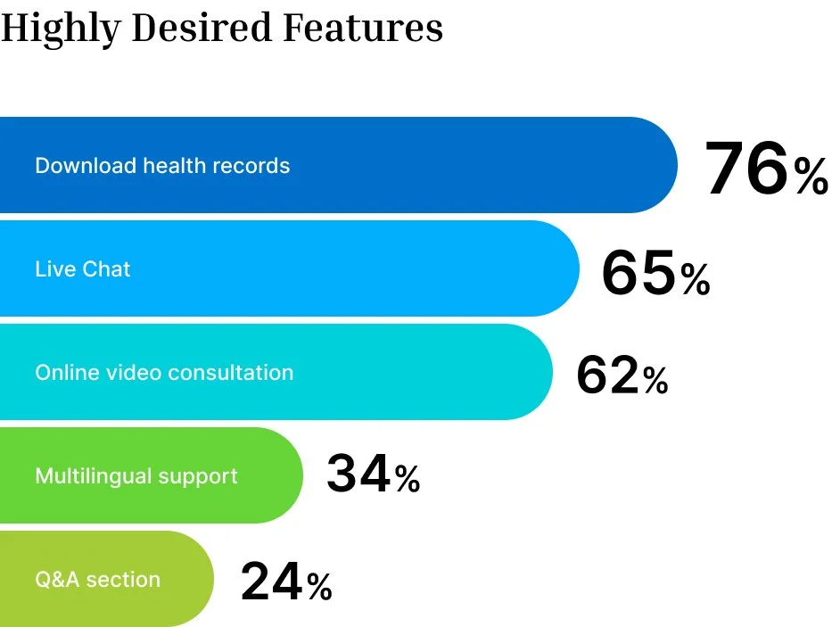
Users voiced a significant demand for enhanced functionalities, highlighting unmet need such as: downloadable health records, live chat support, and video consultations within the app.
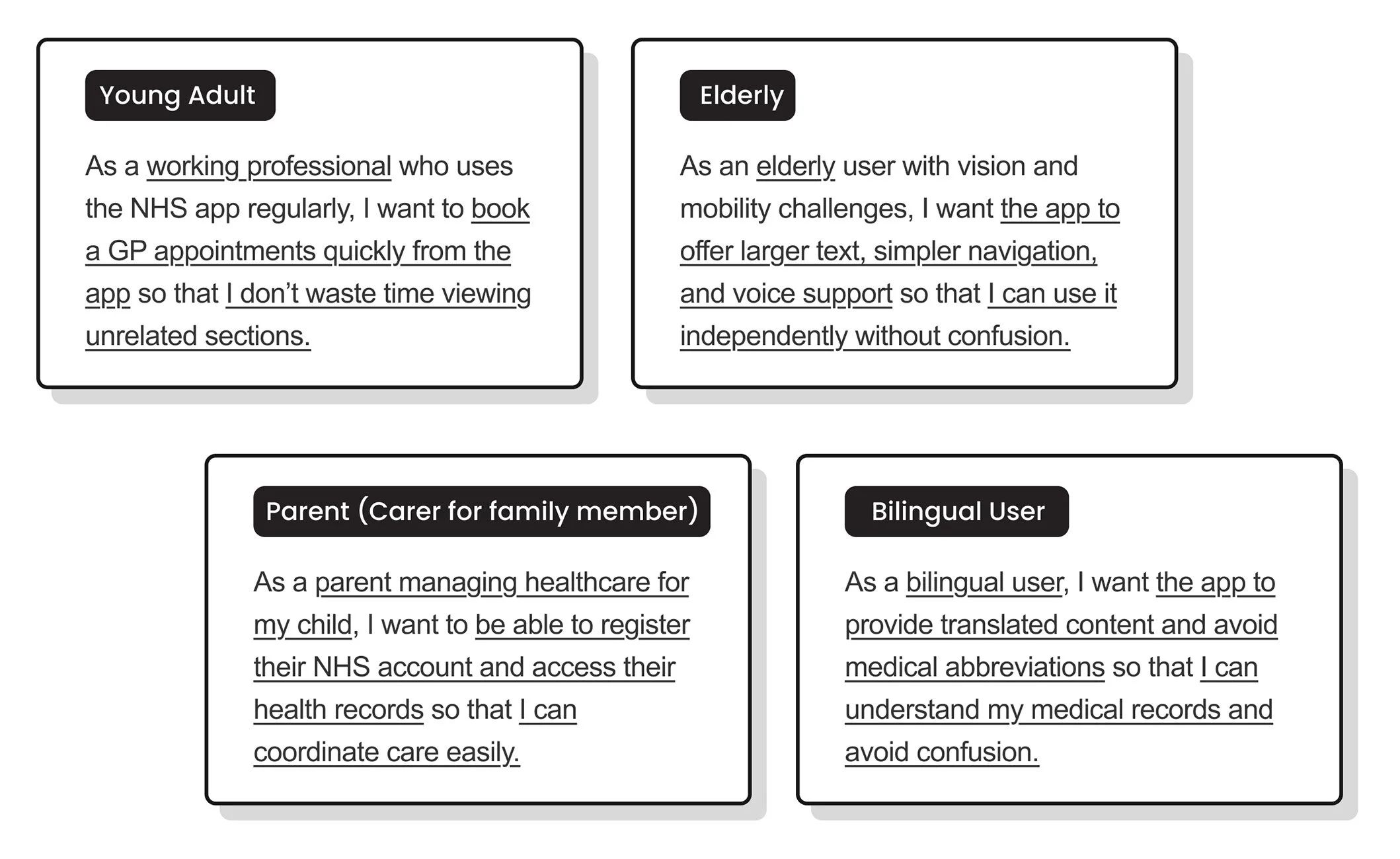
DEVELOPING USER STORIES
To ensure our design decisions resonate with real people, I develop user stories. These narratives are built on authentic insights, capturing the unique goals, frustrations, and needs of diverse user segments.
Key User Segments Addressed:
Young Adults / Older Adults / Parents / Bilingual Users
Impact Example:
A young adult's frustration with complex appointment booking directly led to the creation of clearly labeled, streamlined booking flows to enhance user access.
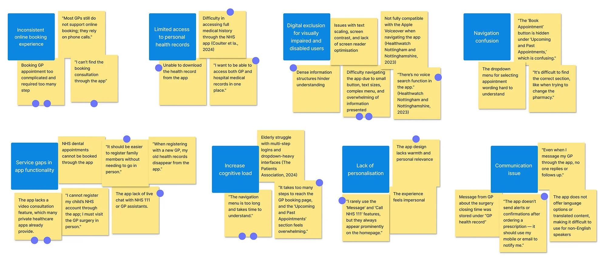
RESEARCH INSIGHTS: AFFINITY MAPPING
To synthesise complex user data, I utilised Affinity Mapping to visually cluster fragmented insights. This process helped identify 8 core themes (blue stickers). and prioritise the most critical usability and accessibility issues through dot voting, focusing efforts on challenges deemed most urgent to resolve.
Through this process, top 3 critical user pain points were identified:
Overly complex GP appointment booking flow
Fragmented and inconsistent access to health records
Unclear and confusing navigation labels
These findings were repeatedly raised in qualitative feedback, MAUQ responses, and supporting research papers.
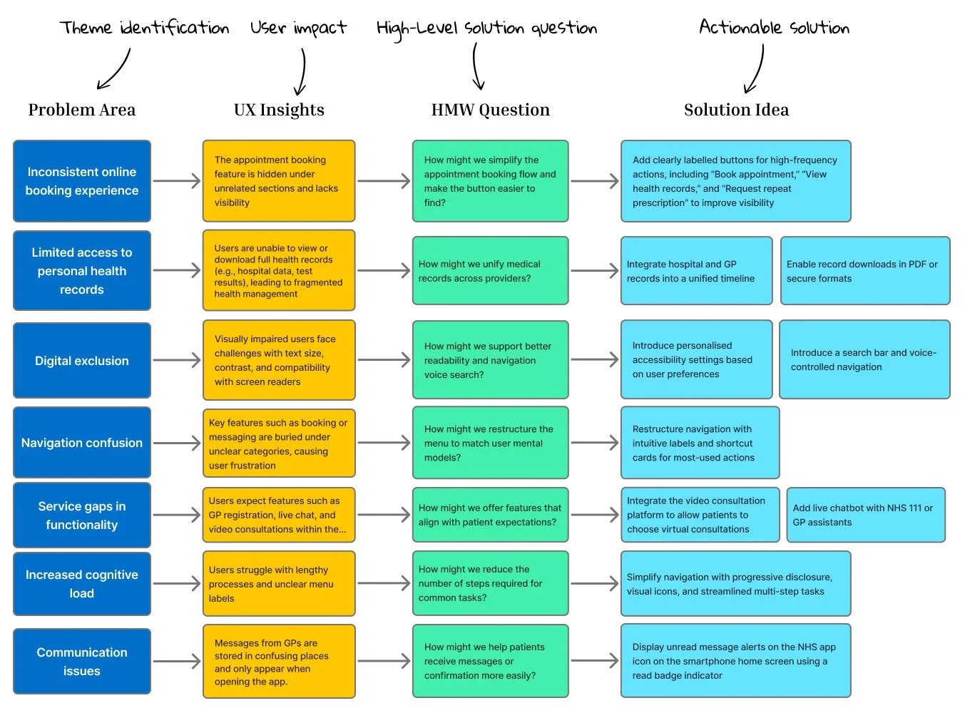
IDEATION: PROBLEM-TO-SOLUTION MAPPING
Following an initial phase of affinity mapping to consolidate and categorise user pain points, a structured Problem-to-Solution Mapping process was employed to systematically address the identified challenges and generate actionable solutions. This ideation process moved from defining core problems to exploring potential solutions, and then detailing specific implementation ideas.
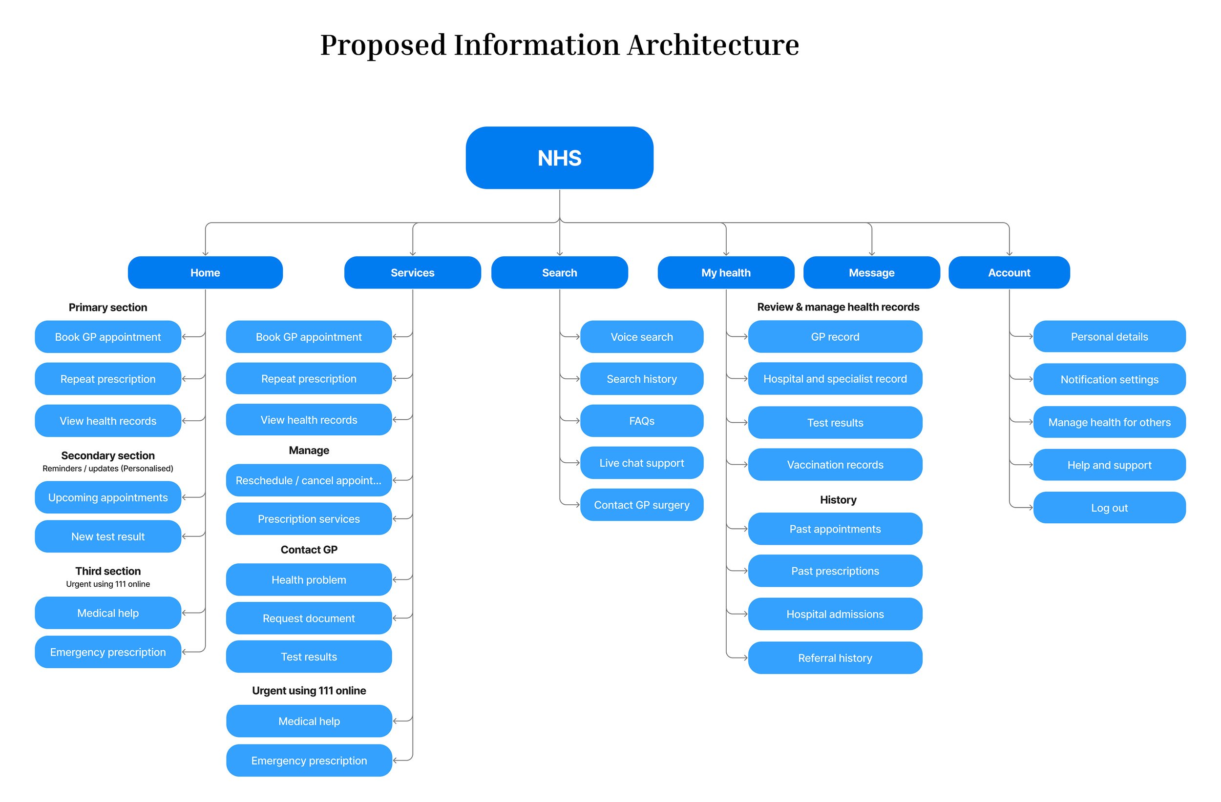
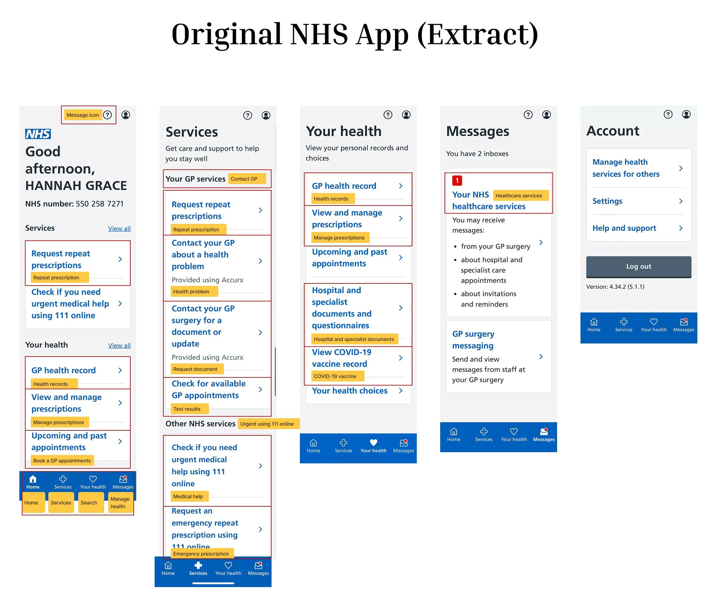
IDEATION: REORGANISED INFORMATION ARCHITECTURE (IA)
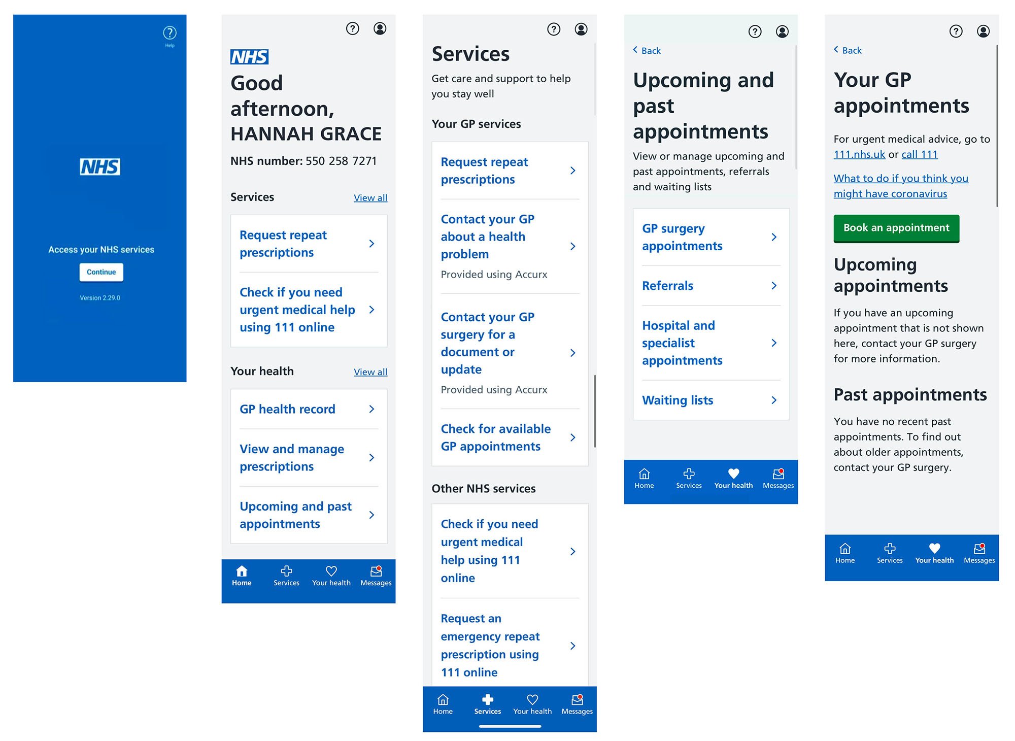
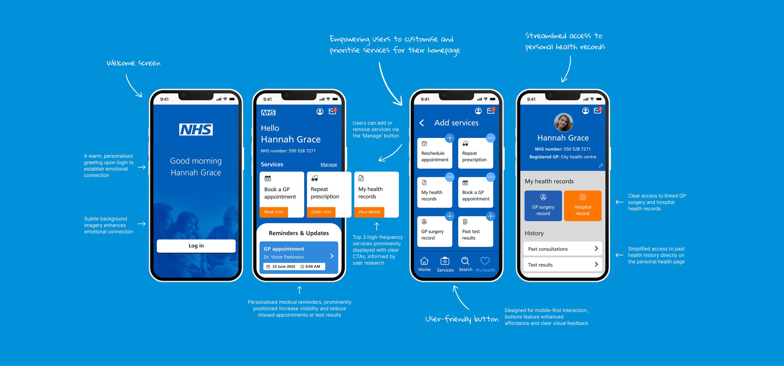
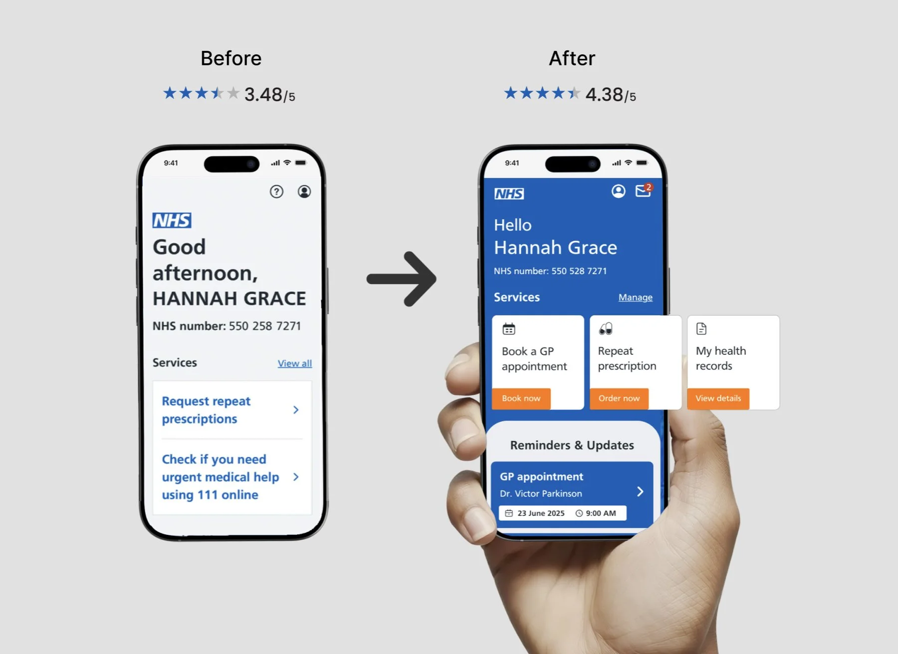
Users struggled with the NHS app's complex navigation. I fixed this by redesigning its information architecture (IA), shown here transitioning from the original interface (left) to my proposed solution (right). My approach introduced simple, clear labels that align with the user's natural expectations, directly addressing previous pain points. This not only reduces cognitive load but also simplifies user journeys, making the app easier and more intuitive for everyone.

IDEATION: LOW-FIDELITY WIREFRAMING & EARLY ITERATION
To quickly test core ideas, I created initial wireframes. These low-fidelity designs focused on the big picture: overall layout and functionality of each page. I applied Gestalt design principles to ensure visual clarity and ease of use from the start. After testing with two users, I immediately iterated on the design, refining it before moving to high-fidelity prototypes.
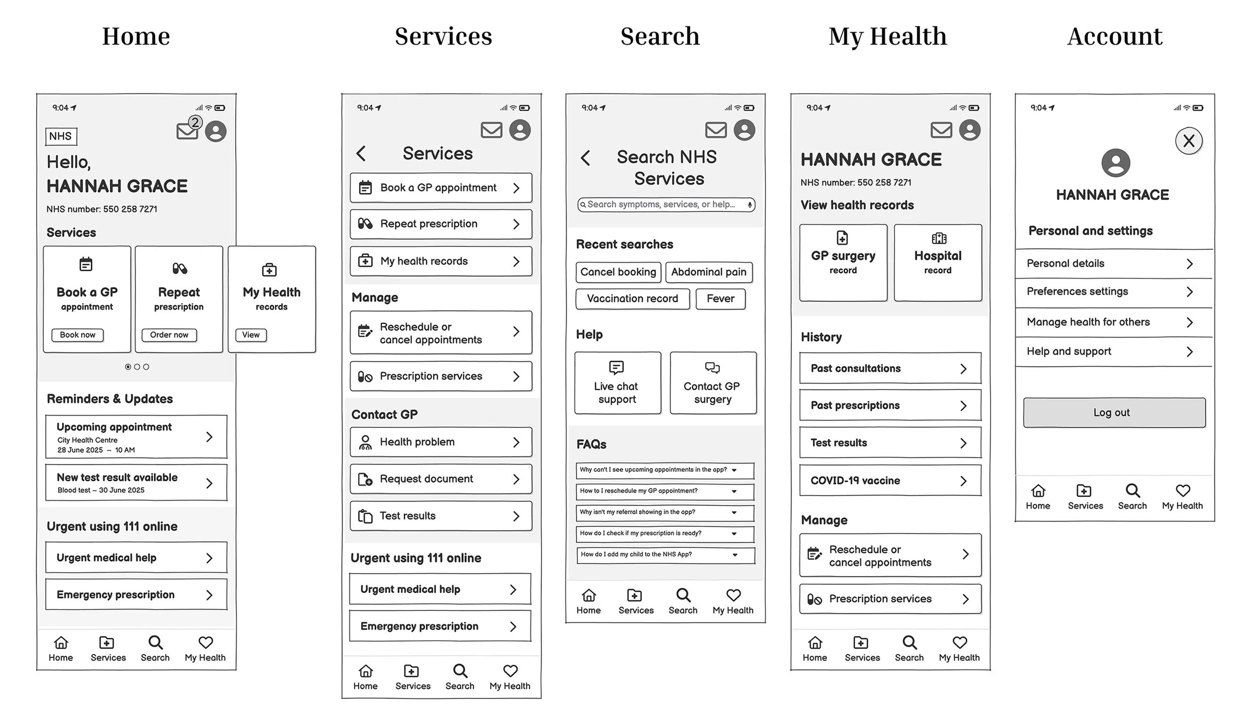
IDEATION: HIGH-FIDELITY PROTOTYPE
Usability & Accessibility Testing
To validate the high-fidelity prototype, I performed think-aloud usability tests with real users and an accessibility review to meet WCAG 2.2 guidelines. This process uncovered important colour contrast deficiencies, which were promptly rectified in the design.
User Feedback
A standout feature for users was the personalised core services on the homepage, which they loved for its adaptability. The reminders and updates within the service section were also enthusiastically received, providing critical information at a glance upon arrival. This valuable feedback directly informed and completed the design refinements.
Project.

Healthcare Tech | B2B & B2C | Online Consultations | E-commerce
End-to-End Design Process | Inclusive Design | Healthcare
FinTech | ESG | Digital Reporting | Survey Data Visualisation

Discovery & Alpha | Digital Product | GDS Compliant | GOV DWP

Responsive Design | B2B Insurance | Information Architecture
Dashboard Design | Data Visualisation | Widgets | KPI Tracking