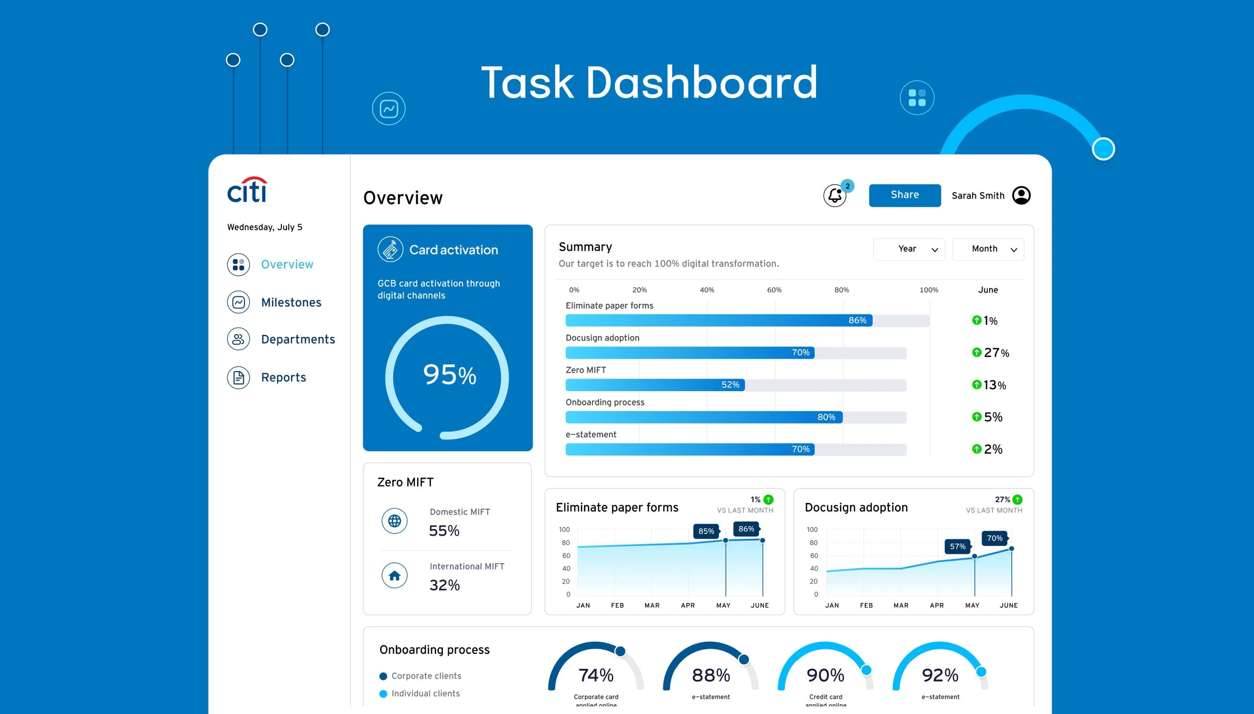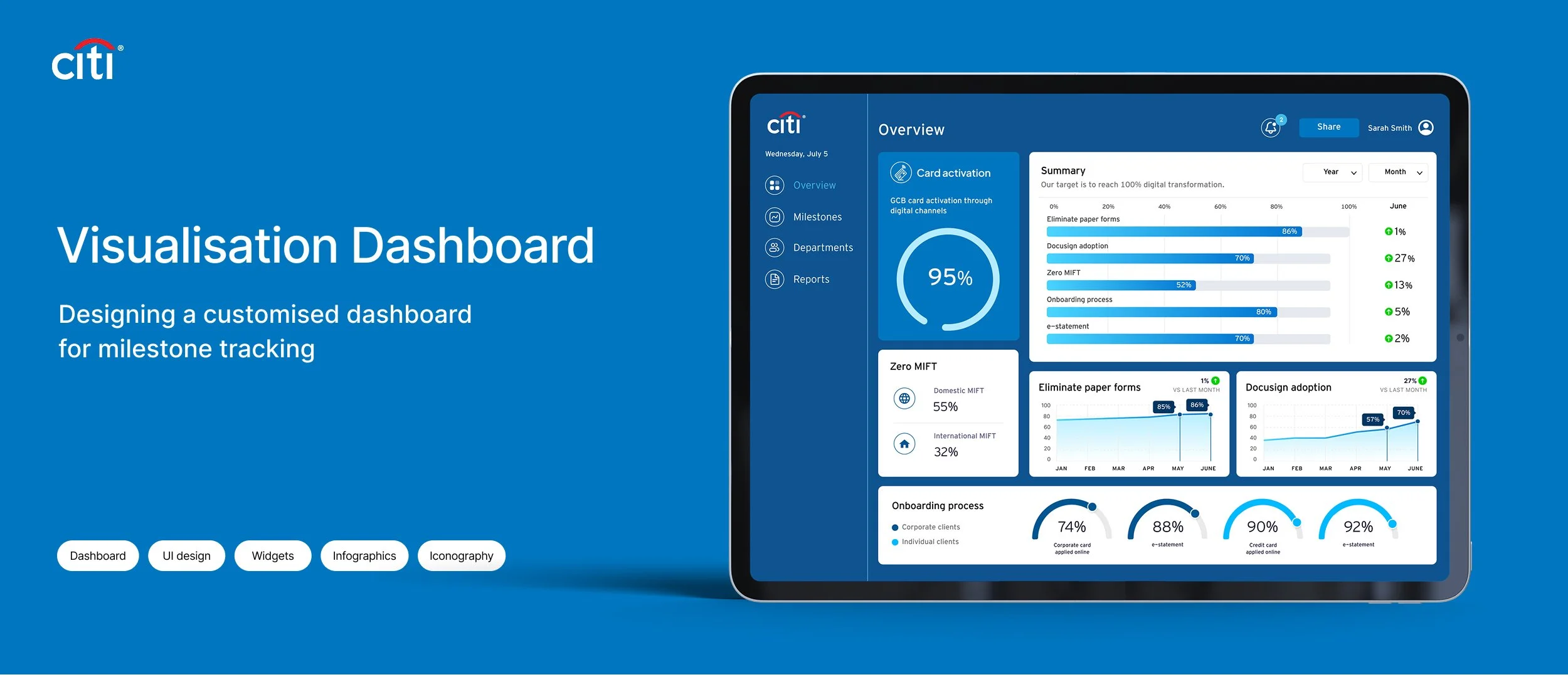
A data visualisation dashboard was designed for Citi to track progress toward its 100% digital transformation goals. The dashboard highlights 6 key performance indicators, keeps internal teams updated on milestones, and aligns progress with Citi’s ESG objectives while supporting the client fintech journey experience.
Dashboard interface design, widgets, iconography
User experience (UX)
Interactive transaction recommendations
Client communication
MY ROLE

Understanding business objectives and translate them into clear goals.
Transform complex, raw data into an engaging, easy-to-understand visual narrative.
Convert static infographics into dynamic, modular dashboard widgets for easy updates.
Encourage colleagues to return regularly, making the dashboard not only a reporting tool but also a motivational hub.
CHALLENGES
SOLUTIONS
The final dashboard clearly presents 6 key performance indicators that tell a clear data story, also highlight the most successful metric.
Designed in a clean, intuitive layout, it keeps teams updated on milestones, aligns with target 100% digitalisation goals.
IMPACT
The dashboard became a central tool for internal teams, providing clarity, motivation, and alignment with Citi’s digital transformation journey. By turning data into a compelling visual story, it improved engagement and encouraged consistent milestone tracking.
Project.

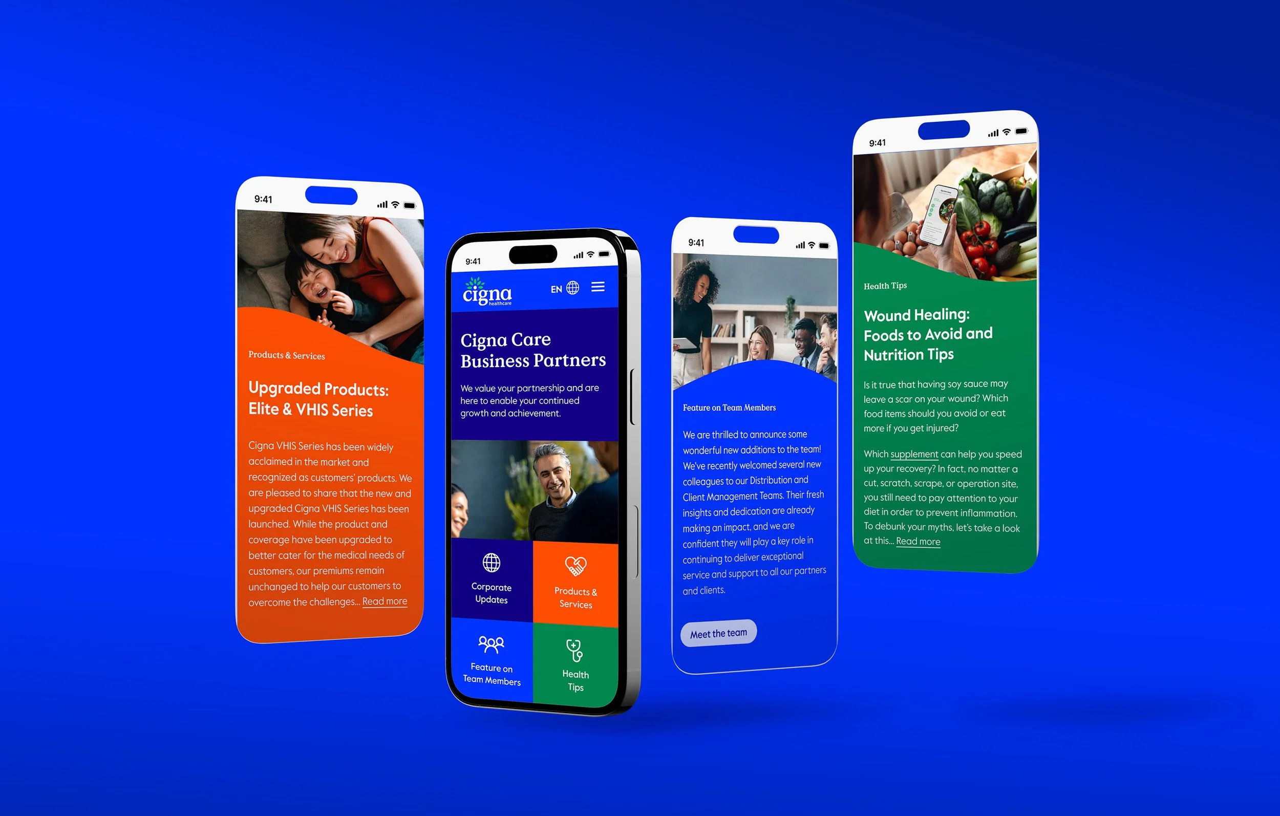
Healthcare Tech | B2B & B2C | Online Consultations | E-commerce
End-to-End Design Process | Inclusive Design | Healthcare
FinTech | ESG | Digital Reporting | Survey Data Visualisation

Discovery & Alpha | Digital Product | GDS Compliant | GOV DWP

Responsive Design | B2B Insurance | Information Architecture
Dashboard Design | Data Visualisation | Widgets | KPI Tracking