My Role & Activities
Translated research insights into actionable UX solutions
Produced responsive wireframes and high-fidelity prototypes
Optimised existing landing pages and designed new pages for upcoming campaigns
Worked closely with developers for smooth implementation
Created promotional graphics and Instagram story content to drive user engagement
Sector
Healthcare | Skincare | E-Commerce (B2C & B2B) | Online Consultations
Duration
1 Year
Enhance the User Experience of GetHarley Platform
Overview
GetHarley is a telehealth platform offering online consultations and medical-grade product sales. As a UX Designer, I led the redesign of key booking flows and interface components to improve mobile usability, boost engagement, and deliver a premium digital experience that reflects the brand’s values.

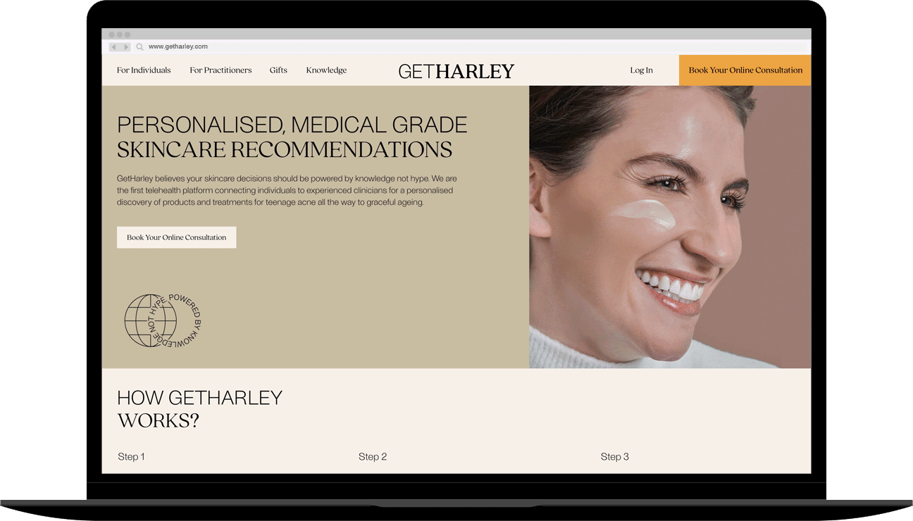
Landing page
Pain points
It struggles with insufficient interest in further exploration.
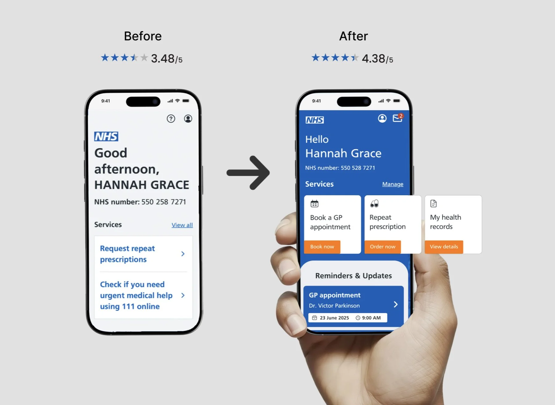
The landing page plays a critical role in forming first impressions, it often determines whether users stay or leave. However, behavioural data revealed that visitors were spending only a brief moment on the page and frequently exited without scrolling. The lack of visual hierarchy and interaction made the navigation feel passive and uninviting, highlighting a key opportunity to re-engage users.
Solutions
Enhanced visual harmony, introduced interactive elements, and adopt UX writing.
Refining the design system by updating UI components. This included the layout grid, navigation bar, font sizes, and spacing. I optimised imagery adjusted button dimensions, and introduced whitespace to improve visual clarity and reading flow.
Introduced interactive elements to make the experience more dynamic. Subtle motion cues and microinteractions were added to guide users and encourage them to scroll and explore the page.
Improved UX writing by recommending a shift to more active, benefit-driven tone. This made content more compelling, helping users understand what they could do or gain from the platform.

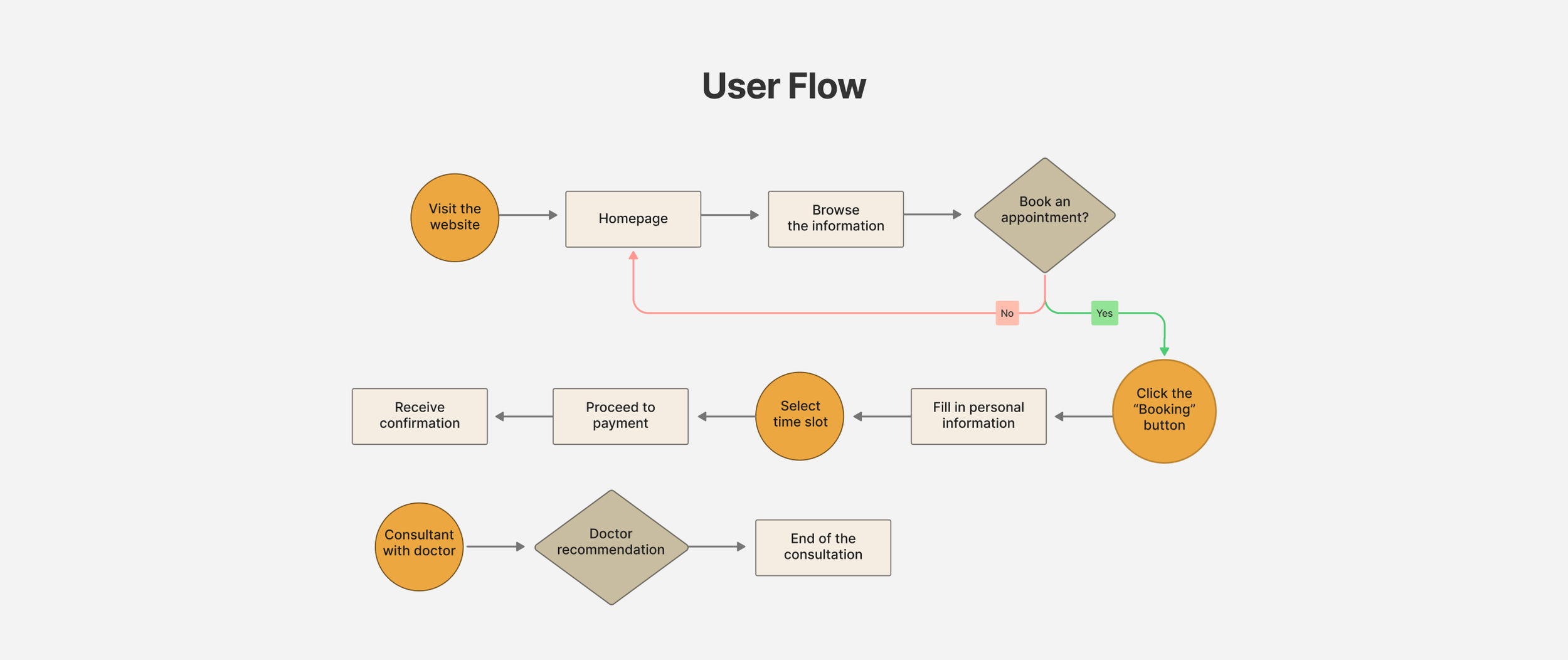
User Flow
Pain points
Ineffective communicate leads to user confusion and impatient.
The “How It Works” section is designed to guide users through booking an online consultation, connecting with a skincare professional, and receiving personalised treatment products. However, the content was overly complex, leading to confusion and user drop-off during the booking process. Without a clear explanation of the steps involved, users were more likely to abandon the journey. Optimising this section for clarity and simplicity was essential to improve comprehension and encourage successful bookings.
First, I mapped out user flow diagrams to understand how users navigate the booking journey, (i) from selecting a consultation, (ii) filling out forms, (iii) answering skincare problems, (iv) making payments, (v) to receiving follow-up care from a clinician.
Based on these insights, I transformed the complex journey into a clear, 3-step visual explanation using UX writing and visual design:
Broke down the flow into intuitive, digestible stages
Used short, actionable copy for better comprehension
Incorporated icons and visual cues to support quick scanning
Maintained logical sequencing and consistent formatting
Solutions
Constructed user flow diagrams, simplified content with rules of three principles.

Booking Appointment Journey
Pain points
User data revealed notable friction in the online booking flow. Many users encountered confusing or repetitive form fields and abandoned the process midway. The calendar page emerged as a particular pain point:
Missing day labels and time zone indicators led to uncertainty
Users were repeatedly asked to select time slots, causing frustration
The loading animation between steps lacked smoothness and responsiveness
Solutions
To resolve these pain points, I focused on streamlining the user journey and reducing friction in key interaction moments:
Simplified form fields and removed unnecessary steps to shorten the booking process
Redesigned the calendar interface to include clear weekday labels, visible time zones, and persistent slot selection
Improved loading transitions to enhance perceived performance and reduce user anxiety during waits


Redesign landing page
Pain points
The gift-giving page experience was inefficient and distracting.
The webpage was overloaded with text-heavy information that was irrelevant for gifting purposes. Additionally, the colour scheme was excessively pale, resulting in a lack of visual appeal. Furthermore, users were required to make an extra click before proceeding to purchase and checkout, which was inconvenient and unattractive.
Solutions
Standardising the user interface to a cohesive design.
Integrating captivating text alongside visually appealing images, ensuring that text and images align perfectly to convey the story clearly. Also, I adopted a 12-column structure to organise a 2 column content layout. These approaches aim to create an evenly-spaced layout grid for this viewport and minimise drop-offs by reducing unnecessary interactions.

Project.

Healthcare Tech | B2B & B2C | Online Consultations | E-commerce
End-to-End Design Process | Inclusive Design | Healthcare
FinTech | ESG | Digital Reporting | Survey Data Visualisation

Discovery & Alpha | Digital Product | GDS Compliant | GOV DWP

Responsive Design | B2B Insurance | Information Architecture
Dashboard Design | Data Visualisation | Widgets | KPI Tracking