Why doesn’t M&S have its own grocery app yet?
Back in 2019, M&S made a bold move. Instead of building a grocery app from scratch, it partnered with Ocado, gaining instant access to delivery tech, logistics, and an online retail presence. On paper, it seemed like the perfect shortcut but it left a missing direct digital touchpoint between M&S and its customers. So, what are the gaps?
Customer Experience Gap
Shoppers using Ocado order and delivery don’t feel like they’re shopping with M&S.
The M&S tone and brand voice are missing, and Sparks loyalty isn’t integrated into the experience.
Product & Service Gap
With 95% of products private label, M&S can’t deliver the full “weekly shop” customers expect.
If another disruption like COVID occurs, M&S risks losing even more profit without its own resilient grocery channel.
Strategic Gap
M&S positions itself as digital-first, yet relies on a partner’s app for a core retail service.
The Ocado venture feels like a short-term fix, not a sustainable digital strategy.
The Opportunity
Over 55% of M&S customers are aged 55+ (Global Data, 2021), they are loyal and value accessibility and simplicity.
Gen Z shoppers (Saturn Visual, 2024) are highly tech-literate and expect modern, personalised digital experiences.
Competitors like Tesco, Sainsbury’s, and Waitrose already provide strong grocery apps, raising customer expectations.
M&S risks falling behind unless it develops a dedicated grocery experience that serves both its long-time loyal customers and younger, tech-savvy audiences. Recognising these gaps and opportunities inspired me to take on this research project.
Key User Insights
What I found through surveys and interviews were important and interesting patterns in how people shop for groceries:
Different behaviours, different needs
Some shopper may prefer offer attraction, others may like to purchase some same products as previously, so history order and searching are must elements. The personalised concept for today’s shoppers are most considerate.
Multiple options matter
Most shoppers don’t stick to just one supermarket, they usually have two or more choices depending on price, convenience, and availability.
Discounts first, quality second
M&S customers are willing to pay for premium-quality food, but their shopping journey often begins by scanning discounts before browsing for their favourites.
Eco-delivery welcomed
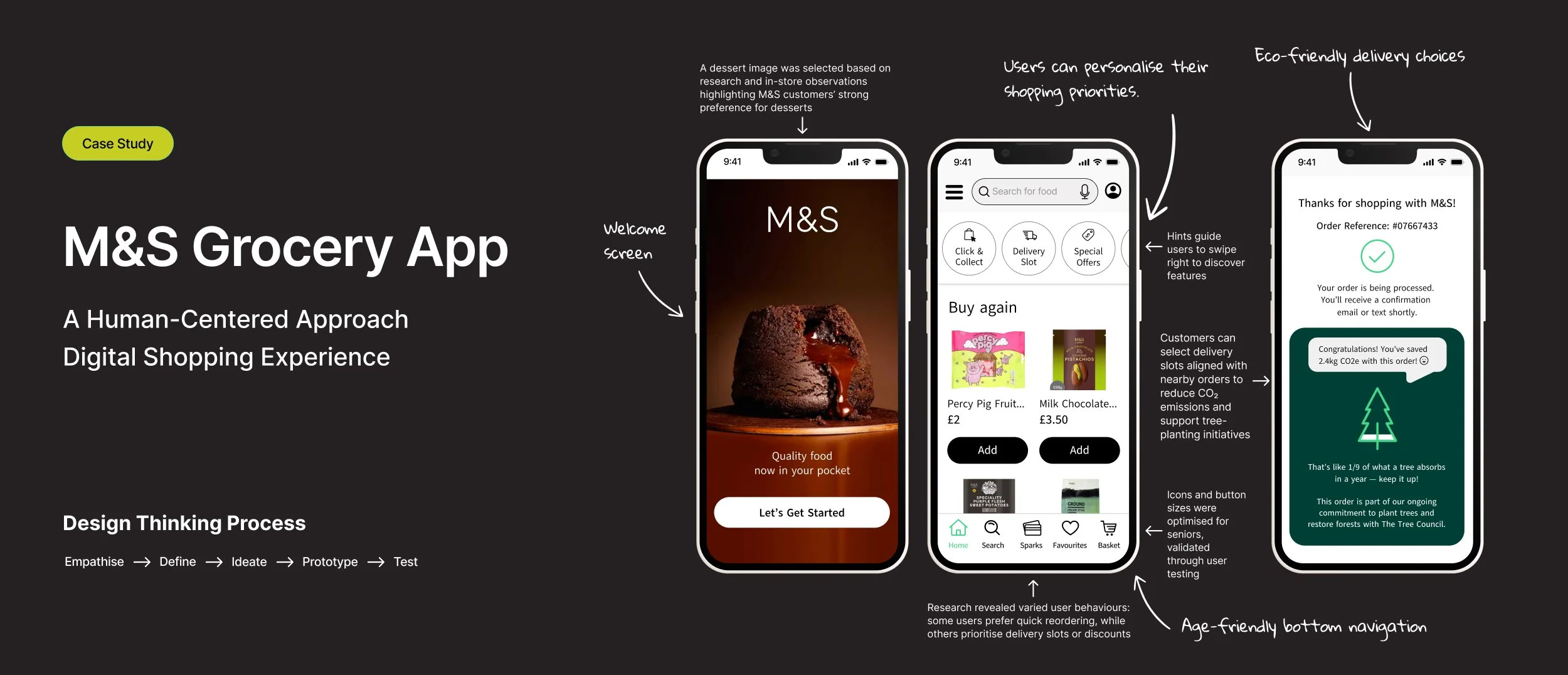
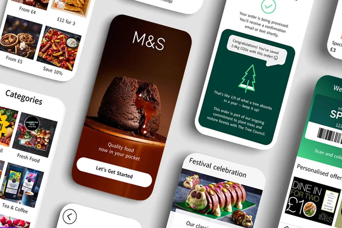
Shoppers liked the idea of choosing eco-friendly delivery slots that align with others in their area. They especially liked the “save tree award” concept, showing how their choice reduce CO₂ emissions and planting trees, but better without extra cost.
My Solution
I designed more than just a grocery app that completes transactions. Instead, I created a user-centered digital experience that reflects the M&S brand values while balancing usability, emotional engagement, and the latest UX trends.
Key differentiators:
Eco-delivery options – Encourage sustainable choices by allowing customers to select eco-friendly delivery slots that reduce emissions.
Personalised homepage (Generative UI) – A dynamic experience tailored to each shopper’s habits and preferences, driving deeper engagement.
Elderly-friendly design – Readable text, finger-sized buttons, and simplified navigation. While iOS and Android offer accessibility settings, not all older users have the latest smartphones — so accessibility is built directly into the app’s design.
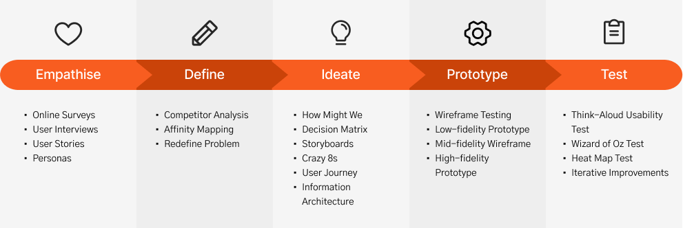
Design Thinking Process
Project.
UI Design | User Flow | E-Commerce
Enhanced the User Experience of GetHarley’s Skincare Platform
UX Research | Service Design | GOV.UK Standards

Designing a State Pension Tool for DWP (Case Study)
UX Research | Accessibility | Healthcare

Enhanced NHS App for Better User Engagement (Case Study)
UX Design | Personalisation | Retail
Designing a Human-Centered Grocery App (Case Study)
FinTech | ESG Communication | Digital Report | Banking

Building Citibank Net Zero Report for a Sustainable Future
UI Design | B2B Website | Insurance
