Hi, I’m Margaret.
an UX Designer.
I’m a UI/UX Designer with a strong background in visual design, offering me a unique advantage in creating visually appealing interfaces and adopting a user-centered approach to define and address user pain points effectively. I enjoy working with people, picking up new skills along the way, and hunger for growth.
UI/UX Work.
Revamping homepage for desktop and mobile platforms
Overview
The redesign project for GetHarley skincare services with an eCommerce platform offers an exciting opportunity to enhance the user experience, particularly by improving the process of booking online consultations. The primary objective is to reimagine the platform's homepage for both desktop and mobile devices. This involves designing visually appealing and user-friendly interfaces that effectively guide and engage users throughout the consultation booking process. By utilising insights gathered from user research and data analysis, the goal is to identify and address pain points, ultimately leading to enhanced overall satisfaction and increased conversion rates.
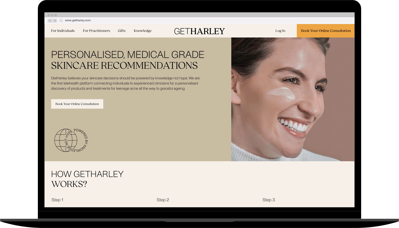

Main section
Pain point
While the main section of the homepage landing is meant to warmly welcome visitors and provide a comprehensive overview of the platform's offerings, it currently struggles with low user engagement. Visitors tend to spend only a brief amount of time on the page before leaving, indicating a lack of interest and interaction. The static nature of the website exacerbates this issue, making navigation cumbersome and exploration unexciting for users. This initial impression creates a significant pain point, highlighting the need for improvements to enhance user engagement and encourage further exploration of the site.
Solution
To address the point points and improve user engagement, incorporating user feedback and insights into the design process can help tailor the hero section to better meet the needs and preferences of the target audience.
Firstly, I overhauled the design system of reusable UI components, refining the layout grid, adjusting navigation bar, font sizes for titles and body copy, fine-tuned spacing and line height, as well as optimised image and button sizes for improved visual harmony throughout the interface. Secondly, I introduced interactive elements to make the browsing experience more engaging and dynamic, also spare a cue to next section encourage scroll down to explore the page. Third, I suggested the UX writing to be more active tone. Overall, those enhancement improved readability, visual hierarchy, and usability, thereby capturing users' attention and encouraging them to explore further.

How It Works section
Pain point
The "How It Works" section is intended to guide visitors through the process from how to book an online appointment, consulting with a doctor and deliver skincare treatment products. However, the current presentation of this section may not effectively communicate the steps involved, leading to confusion and impatient among users. The complicated contents in conveying the process could hinder users from proceeding with booking an appointment, resulting in a suboptimal user experience. Thus, optimising this section to provide clear and concise explanations of each step is crucial for enhancing user understanding and facilitating seamless navigation through the booking process.
Solution
The solution for this section involved several steps to enhance user understanding and streamline the booking process. Firstly, I conducted comprehensive user flow diagrams to gain insights into how users navigate through the platform, from seeking an online consultation process to consulting with a doctor. Based on these insights, I simplified the content, breaking down the process into clear, digestible steps. This included using concise language, incorporating icons for visual representation, and ensuring a logical flow of information. The overall objective was to streamline the user journey, minimise friction points, and empower users to book appointments with confidence.


Customise cookie consent
Implementing a customised cookie consent feature is essential for ensuring compliance with data protection laws and regulations. By customising the cookie consent, the website can protect user privacy and demonstrate transparency regarding data collection and usage practices. This helps to build trust with users and ensures that their personal information is handled responsibly. I opted for a standout colour tone to draw users' attention and prompt them to make their selection before proceeding to explore the page.

Redesign the interface to improve usability and visual appeal
Overview
The project focuses on enhancing the user experience for gift purchases process. With the goal of improving usability and increasing customer satisfaction, the project aims to address existing pain points and streamline the gift purchasing process. Redesigning the interface to create a more intuitive and visually appealing experience for users. By incorporating user insights and best design practices, the project seeks to optimise the platform for seamless gift transactions.
Pain point
The gift-giving page experience was cumbersome and distracting. The webpage was overloaded with text-heavy information that was irrelevant for gifting purposes. Additionally, the colour scheme was excessively pale, resulting in a lack of visual appeal. Furthermore, users were required to make an extra click before proceeding to purchase and checkout, which was inconvenient and unattractive.
Solution
Standardising the user interface to a cohesive design, consolidating multiple pages into two, integrating captivating text alongside visually appealing images, ensuring that text and images complement each other seamlessly. Adopted a 12-column structure to organise content consistently within a 4–4–4 format. This approach aims to enhance the user experience by creating a consistent interface across products and minimise drop-offs by reducing unnecessary interactions.

Optimising online booking consultation process
Overview
An online consultation has enabled users to engage in appointments with practitioners via video conferencing, eliminating the need to visit clinics in person. This method, accessible through smartphones, computers, or tablets, has become increasingly popular. The project focuses on enhancing the online booking process and overall user experience from the existing platform. This involves refining the process of asking questions, selecting answers, providing personal information, and completing the payment process to improve the efficiency of the booking journey.
Pain point
User research revealed significant frustrations with certain questions and a prolonged reservation process, resulting in high abandonment rates. Additionally, issues were found on the calendar page, leading to a notable decline in website traffic. These issues encompassed missing days of the week, absent time zones, and repetitive prompts for users to select preferred time slots, causing annoyance. Furthermore, the loading animation during the time slot session was observed to be less than smooth.
Solution
To address these pain points, several strategies were implemented. These solutions aimed to streamline the booking process, improve usability, and address user frustrations, ultimately enhancing the overall user experience journey.


