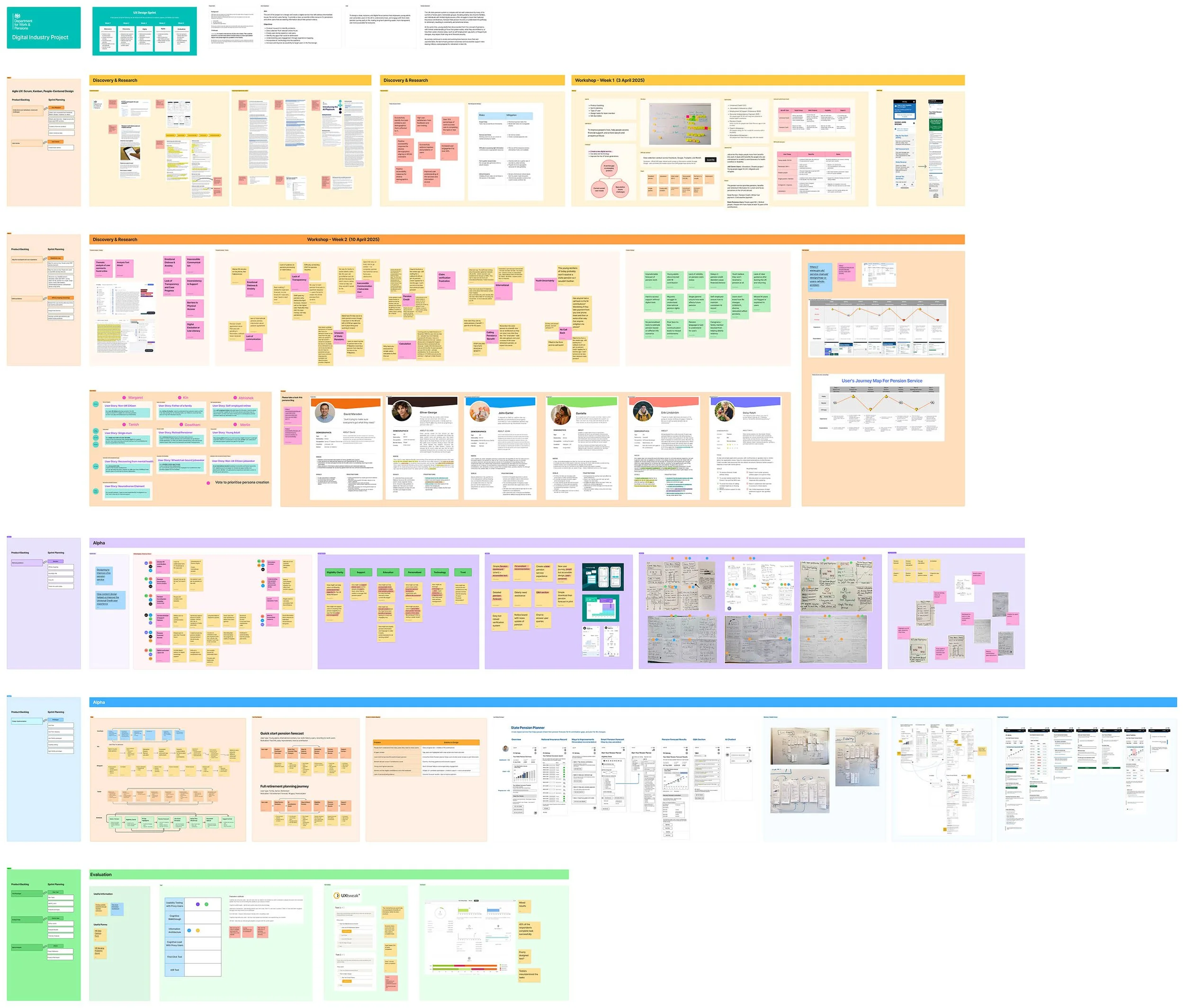
This project was part of a design sprint in response to an open brief from the Department for Work and Pensions (DWP). Our goal was to identify a service gap and design a new digital solution aligned with the UK Government Service Standard.
Through user research and analysis, we discovered that there is a lot user problems and currently no tool within DWP digital services that helps users forecast or plan their state pension. In response, we proposed a new service: the State Pension Planner — designed to help people understand their National Insurance (NI) contributions, project their pension outcomes, and take informed steps to improve them.

My Role & Activities
Conducted research by collected user insights and interviews
Define current unmet problems and forecast future problems
I defined the service gap of State Pensions by observed the data
Meeting with DWP weekly of our design process, review their feedbacks
Mapped out user problems in groups, user stories, reframe problems by affinity mapping, crazy 8s ideation, problem-to-solution mapping, low-fidelity wireframe, usability testing, and evaluation
Sector
State Pensions | Service Design | GOV.UK
Team of 6 People
Researcher | UX Designers | Software Engineer
Duration
5 weeks (April - May 2025)
Tools
Figma | Kanban | Agile UX | Scrum
THE CHALLENGE
Uncover user needs and service gaps within the complexity of DWP services
1. Understanding DWP services
We began by studying how the DWP operates, including its services related to benefits, job support, and pensions. This helped us understand how complex and interdependent these services are.
2. Learning Government design principles
To align with public-sector expectations, we reviewed the GOV.UK Design Principles and the Government Digital Service (GDS) framework — particularly the Discovery and Alpha phases, user needs, and accessibility requirements.
3. Time constraints
We had just five weeks to go from discovery to a high-fidelity prototype, requiring efficient sprint planning and focused collaboration.
THE SOLUTION
4. Limited access to internal data
Without internal access, we gathered insights from public platforms like Facebook, Google, Reddit, and Trustpilot. We used both AI tools and manual thematic analysis to identify recurring pain points and service gaps.
5. Diverse user behaviours
The pension system impacts users with vastly different life paths. We encountered users working overseas, non-UK citizens, and people with life changes such as career breaks, part-time jobs, Universal Credits, or relocation. Designing for this diversity of needs added significant complexity to the process.
Designing a digital pension planner to forecast the pension journey
To address these challenges, we designed the State Pension Planner — a personalised digital service that helps users understand, forecast, and manage their pension journey with greater confidence and clarity.
Our solution included:
A clear and user-friendly dashboard interface
A smart forecasting tool that adjusts pension estimates based on life events like career breaks, relocation, or part-time work
Personalised National Insurance (NI) improvement guidance
Optional support features like dynamic Q&A, AI-powered chatbot
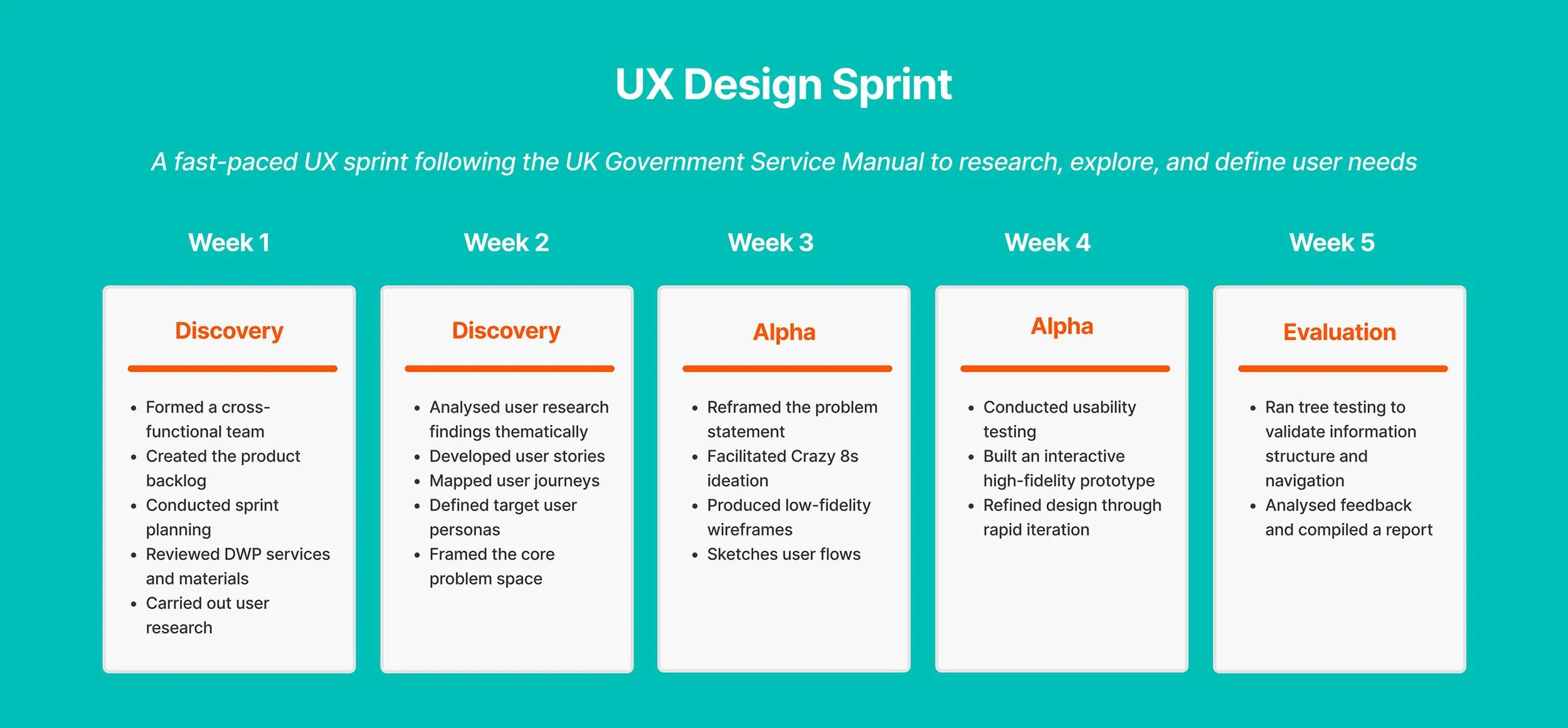
Discovery Stage
RESEARCH
We explored how the DWP’s current services work and analysed user feedback from public forums and social platforms. We also conducted informal interviews with people using DWP services to understand their behaviours and frustrations.
KEY FOCUS
Through this research, I identified a core service gap: users lacked a way to clearly see their pension status or forecast future outcomes. Many were unaware of their current contributions or how life events could impact their retirement income.
Current unmet user needs - e.g., difficulty understanding NI contributions
Speculative future challenges - e.g., lack of clarity during life transitions

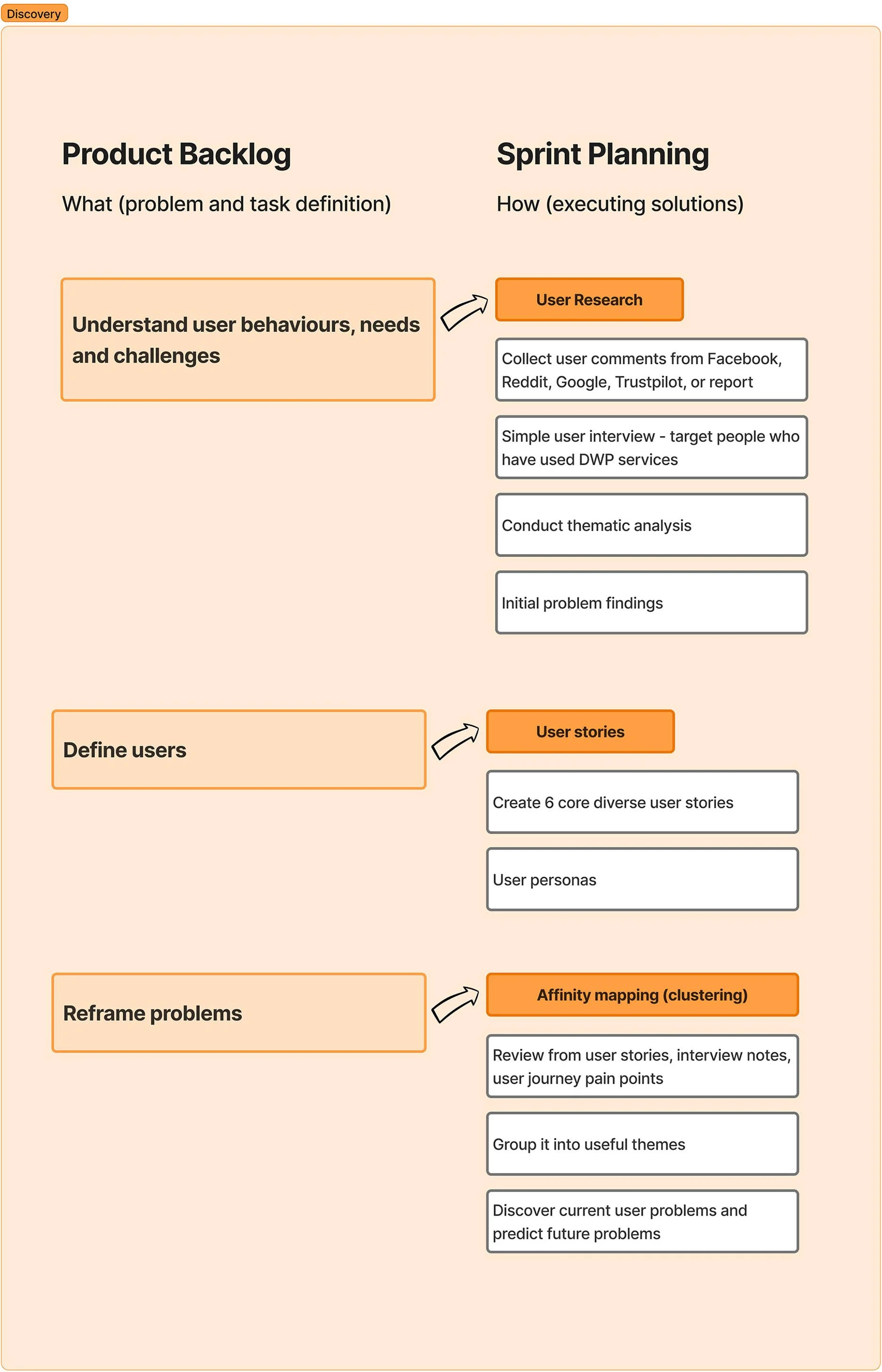
Thematic Analysis
Collected data from social media and using AI-assisted coding
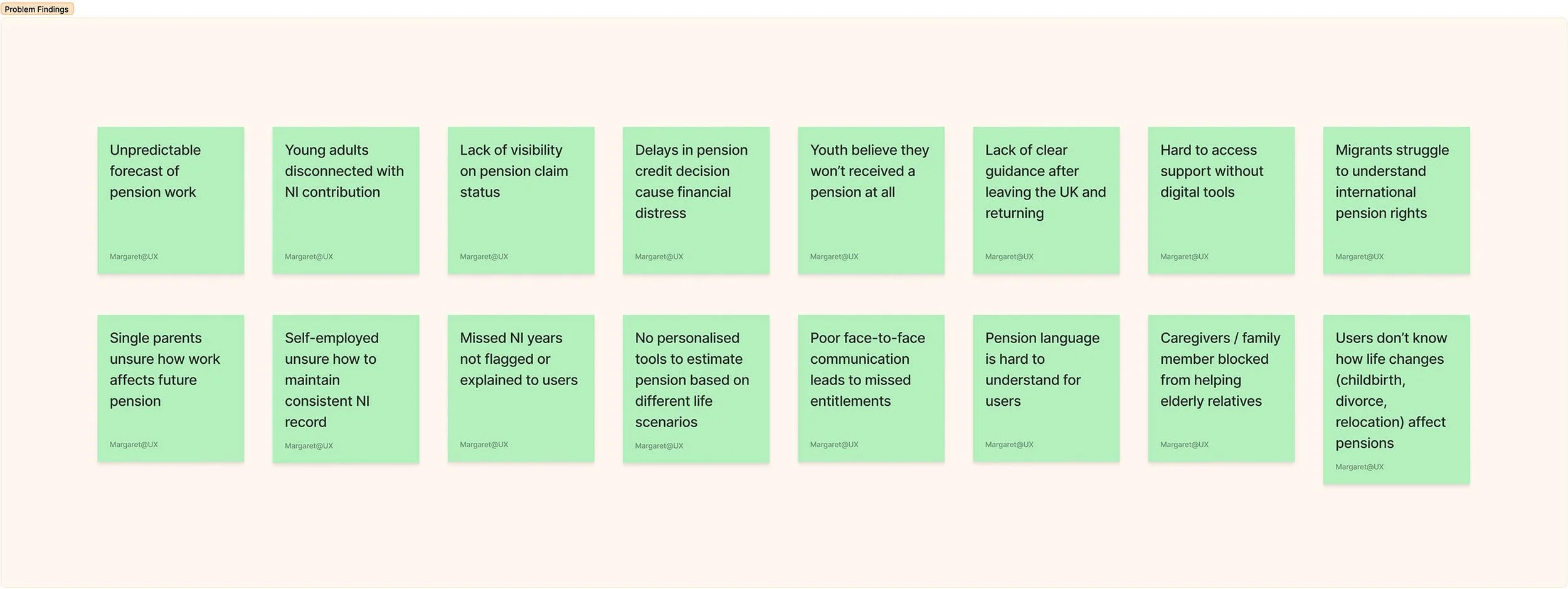
We initially used AI to scan public feedback for recurring patterns, but found it limited in understanding user emotion and context. Manual thematic analysis helped us uncover:
Uncertainty around NI contributions and eligibility
Frustration with missing or untracked contributions
Confusion about how life changes (e.g., career breaks, moving abroad) affect pensions
Limited support for low-digital-confidence users
Lack of personalisation or guidance in existing services
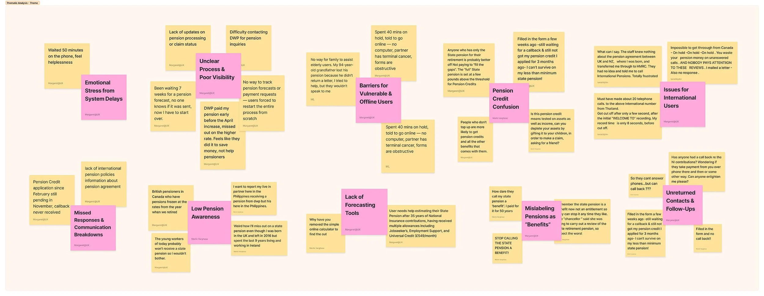
What We Found?
Through thematic analysis of user feedback, I uncovered a range of recurring challenges. These insights revealed significant gaps in the current pension system:
USER STORIES
We created user stories based on our research to represent a diverse demographic, including people from different backgrounds, cultures, employment types, and life circumstances.

SETTING UP PERSONAS
We created 6 personas from the user stories to help the team better understand the needs, behaviours, and goals of users interacting with the state pension system.

USER NEEDS
Based on pain points, I identified what users need from a state pension service.
A clear visibility of how National Insurance (NI) contributions impact their state pension.
Guidance on filling gaps or improve their pension.
Personalised recommendations tailored to their life circumstances.
The ability to track and update their pension forecast over time.
Support tailored to life events (e.g., career breaks, part-time work, or claiming benefits) and how these affect pension outcomes.
A sense of clarity and confidence through accurate and dynamic pension projections.
Alpha Stage
REFRAMEING & IDEATION
With clear insights from discovery, we reframed core problems into design opportunities and began exploring potential solutions. This helped us define clear design opportunities. We then used creative methods like sketching, Crazy 8s, and user flow mapping to explore ideas. These concepts were developed into wireframes and iteratively refined into a high-fidelity prototype, which was tested and evaluated to validate our solution.
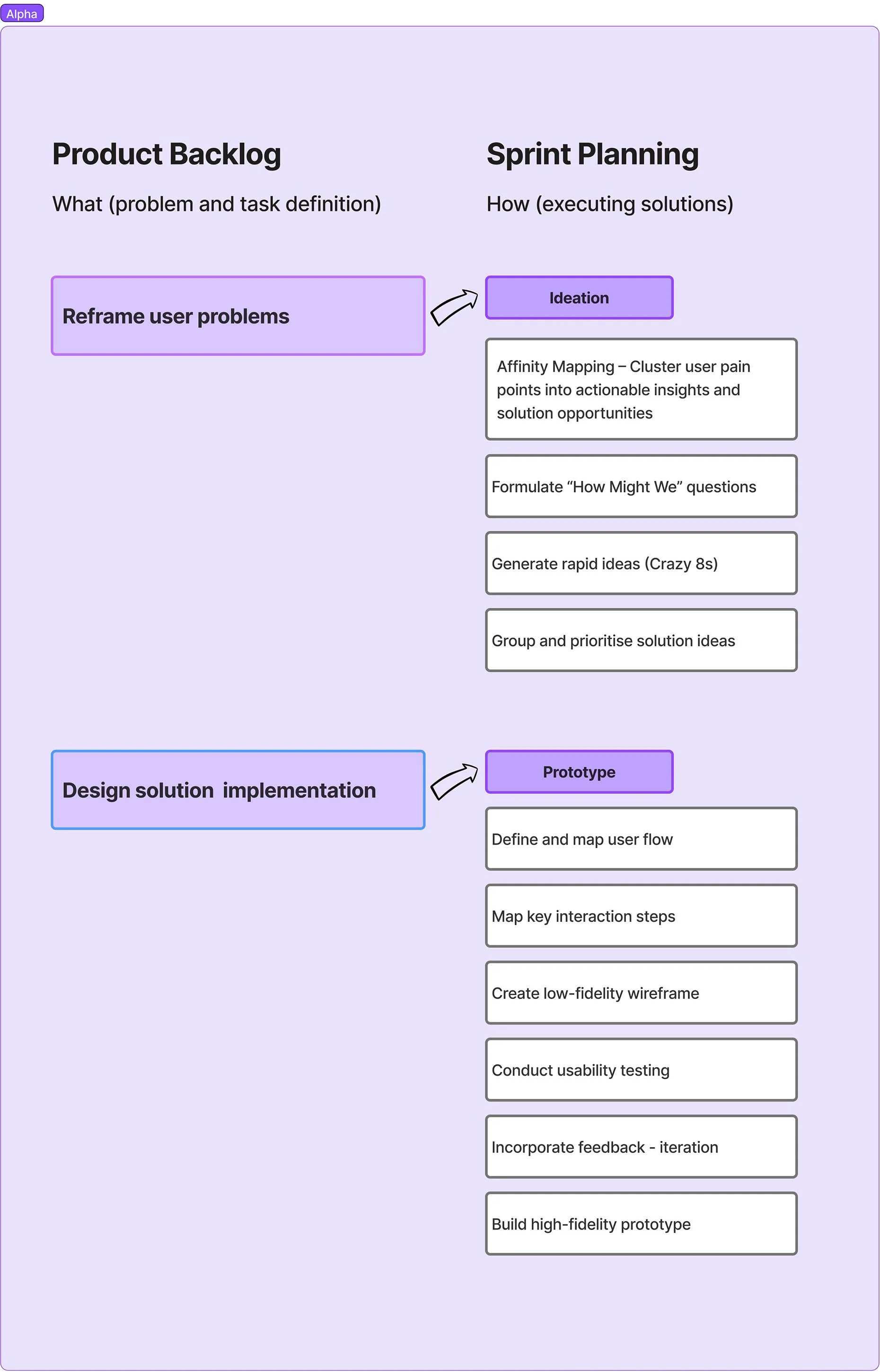
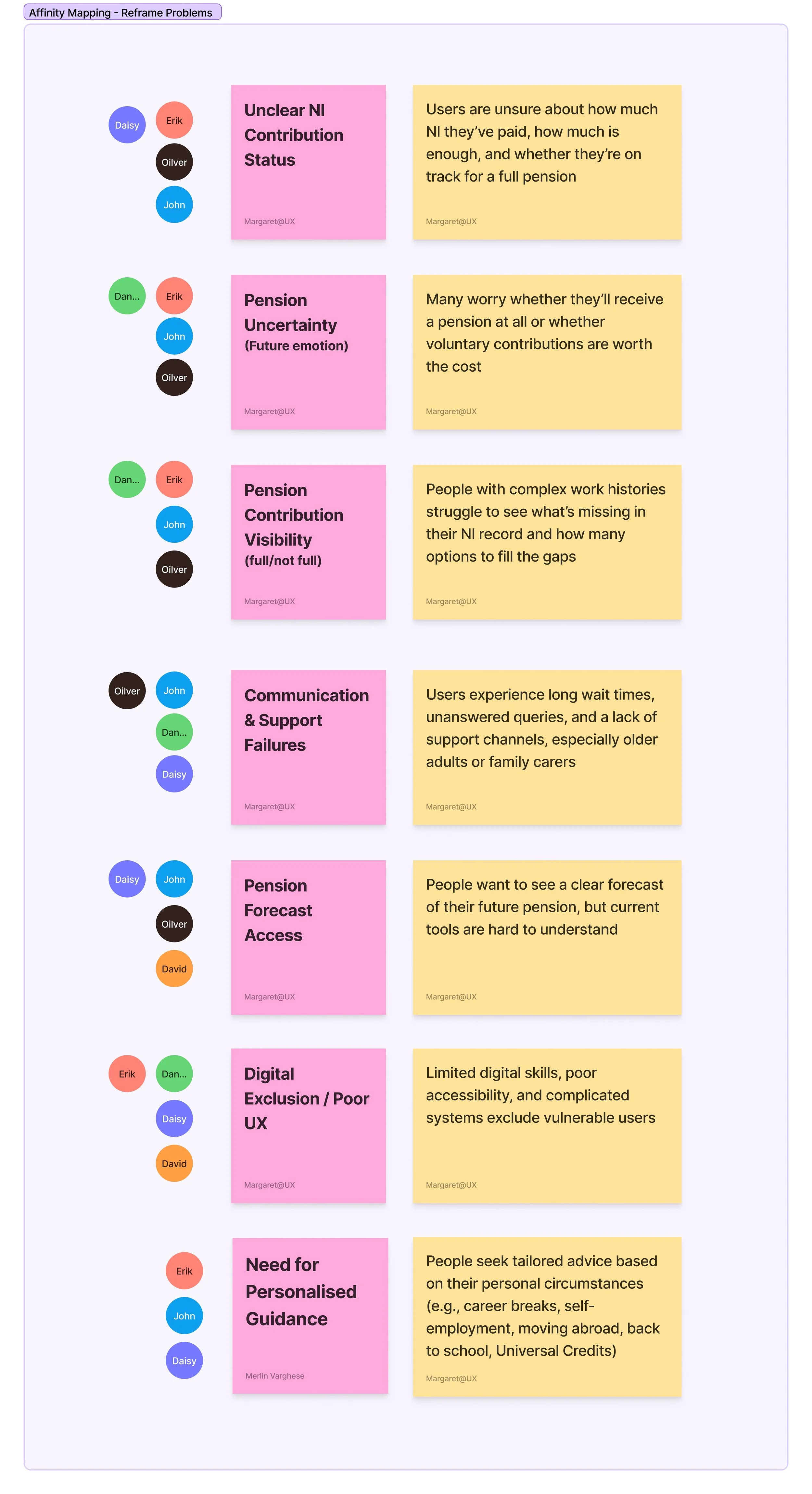
AFFINITY MAPPING
Narrowing down and
cluster user pain points into actionable insights and solution opportunity
We clustered key pain points into actionable insights. This clustering process helped us distill complex feedback into focused insights. These themes reveal critical user frustrations and highlight areas with the most potential for meaningful design solutions.
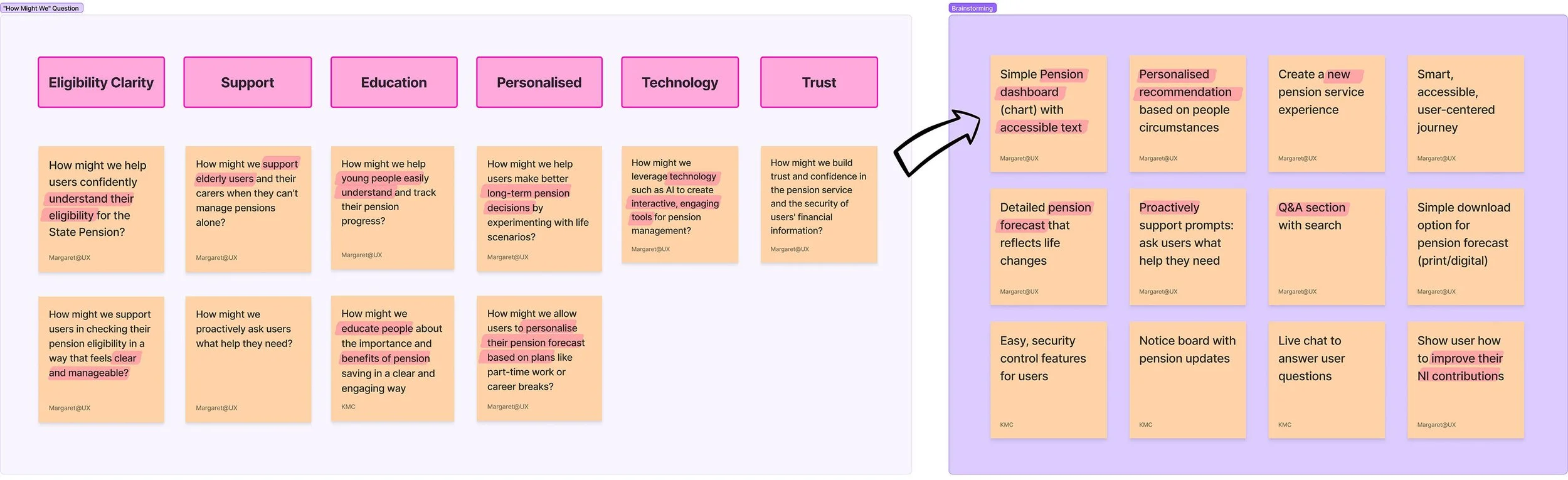
“HOW MIGHT WE” & IDEATION
Turning user pain points into ideas
To transform user challenges into opportunities, we generated a series of "How Might We" (HMW) questions. Each HMW prompt was grounded in real user needs and helped steer our design thinking toward solution-oriented outcomes.
From there, we entered the the HMW prompts key ideas included:
A pension dashboard with accessible, easy-to-read visualisations
Personalised recommendations based on life events and user situations
A simplified, user-centered service journey to improve usability
Supportive features such as live help, a searchable Q&A section, and downloadable forecast
SKETCHES
Rapid UI sketching to explore and prioritise key design ideas
Used the Crazy 8s technique to quickly generate a wide range of UI sketches in response to our research insights. Each team member created eight distinct interface concepts in a short time, helping us explore different ways to improve pension clarity, forecasting, and eligibility support.
After sketching, we clustered and voted on the strongest ideas based on usefulness, feasibility, and alignment with user needs. Key ideas that emerged include:
Interactive Pension Forecast Tools:
UI that allows users to enter work status and life events (e.g., self-employed / career breaks) to calculate forecasted pensions
Real-time pension timeline
Simple bar graphs to visualise current and projected pension
NI Gap Highlighter:
Interface that clearly identifies gaps in National Insurance contributions
Provides guidance on how users can address those gaps (not just pay missing years, but understand their options)

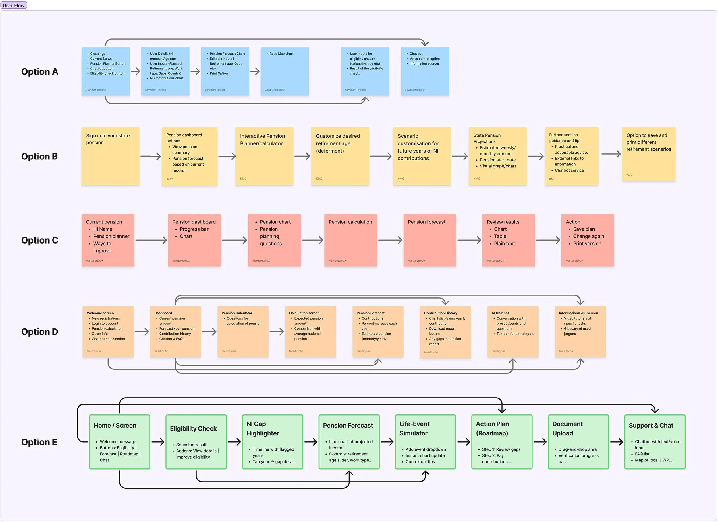
USER FLOW & MAPPING
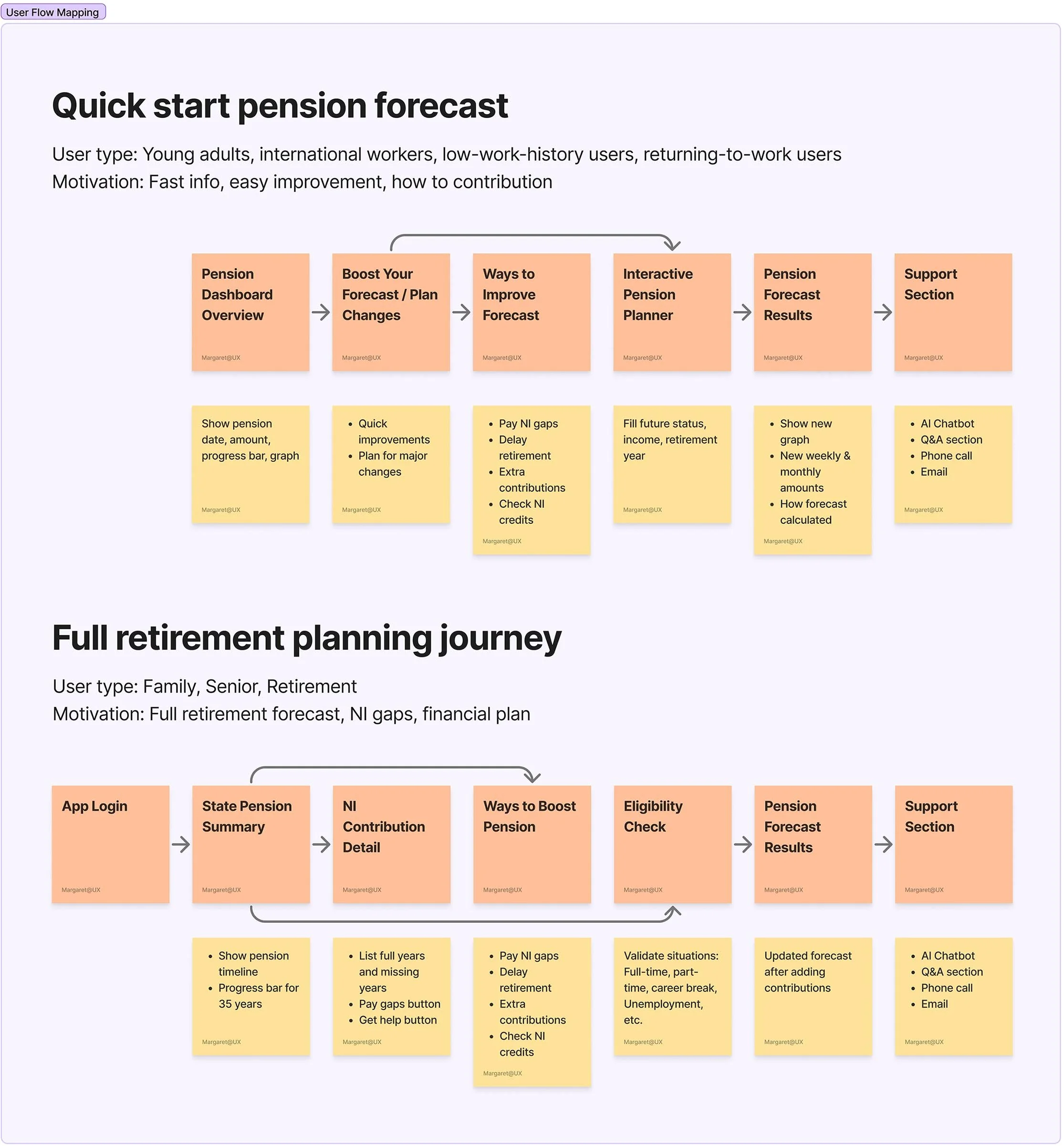
Before starting low-fidelity design, we explored five user flow options and then refined this into two core user journeys:
A quick forecasts journey for younger users who want a fast snapshot
A full planning journey for users who need detailed projections and guidance
Each flow was mapped to include NI status checks, pension forecasts, gap insights, and personalised improvement suggestions.
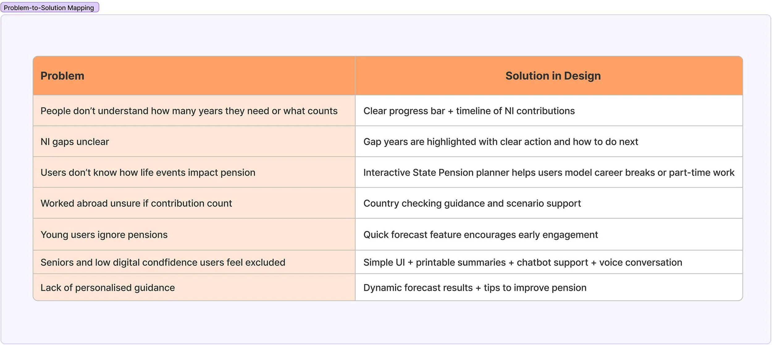
Problem-to-Solution Mapping
To guide design decisions, I mapped specific user problems to UI-level solutions. This helped ensure that every challenge was addressed with purpose and clarity. The mapping also guided me in shaping the interface by connecting user pain points to actionable UI elements.
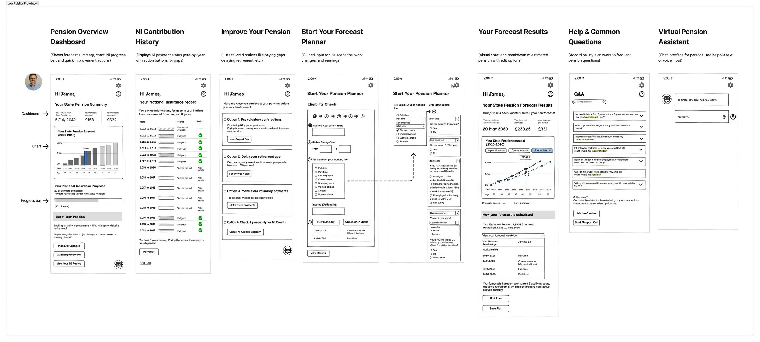
LOW-fIDELITY WIREFRAME
Turning idea into digital wireframes
The core aim of this service is to support users in planning and forecasting their state pensions — a critical functionality currently lacking in existing government apps. I created a low-fidelity prototype, focused on designing a clear, accessible, and supportive journey that enables users to understand their National Insurance (NI) contributions, simulate life events, and explore personalised ways to improve their pension outcomes.
Key screens included an overview dashboard with progress tracking, a detailed NI contribution record, personalised improvement suggestions, a step-by-step pension forecasting tool, and a results screen with visual projections and breakdowns.
In line with UK Government Design Principles, the interface prioritises clarity and usability over decorative visuals, ensuring the service remains inclusive and accessible for vulnerable or low-confidence digital users.
USABILITY TESTING & ITEATION
After creating the low-fidelity prototype,
I facilitated a workshop where team members tested the flow using printed screens
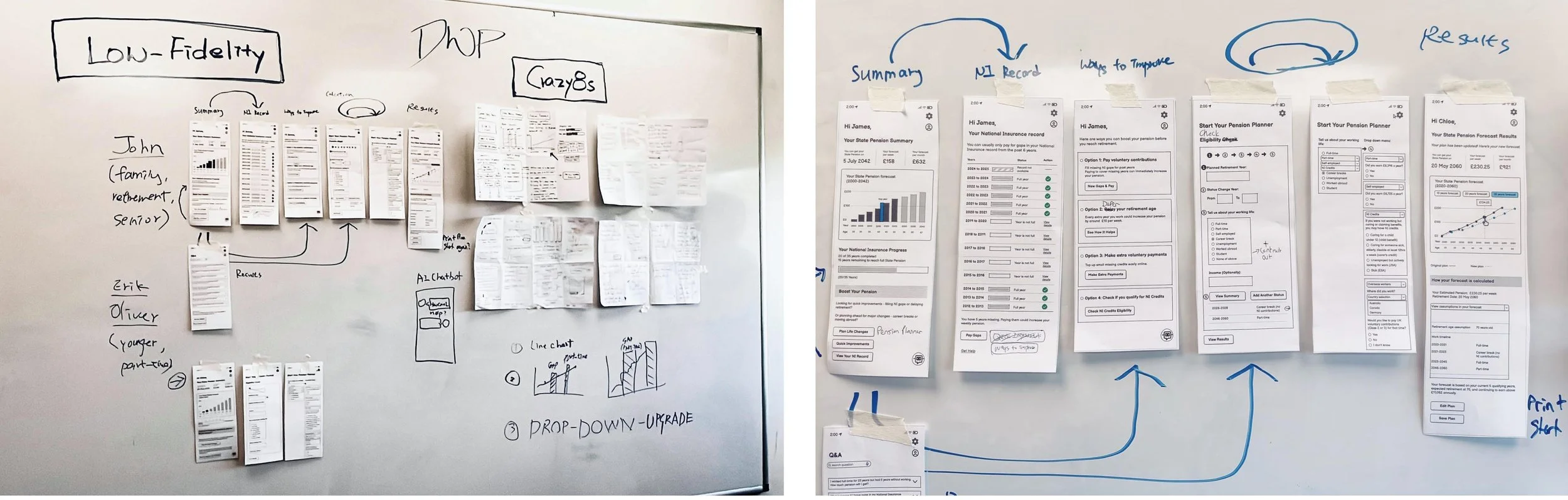
Iteration Process
Since this was a new service design, the testing focused on how users understood the overall flow, navigation, and use of pension forecasting tools. We aimed to see whether the new design helped users better understand their pensions compared to the existing government app.
Based on feedback, we identified several key improvements for the next high-fidelity prototype:
Replacing the bar chart with a more intuitive line graph for forecast trends
Renaming buttons to be clearer and more concise
Refining wording to align with UK Government terminology — for example, specifying types of National Insurance credits
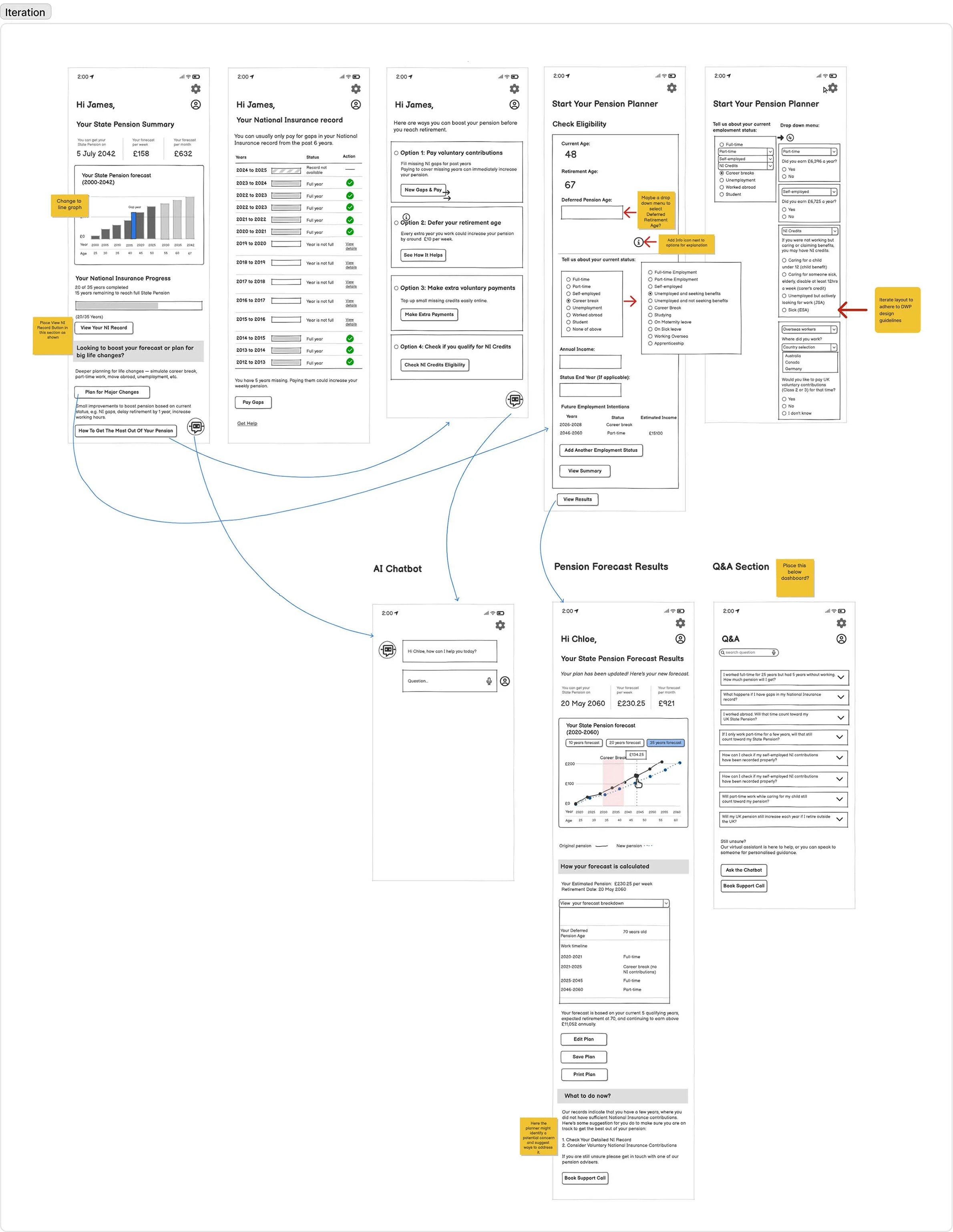
HIGH-FIDELITY PROTOTYPE
After completing the low-fidelity wireframes and applying feedback from usability testing, we moved into building the high-fidelity prototype. One of my teammates led the development of the interactive components. All components followed GOV.UK accessibility and layout standards.
The final screens focused on pension overview dashboard, NI contribution record, personalised improvement options, a step-by-step forecasting tool, final results with visual projections.

What I learned from this project
This project taught me the importance of a structured design process, clear team communication, and critical thinking in collaborative UX work. While AI tools were helped with research, I saw that teammates who relied too heavily on automation can limited their depth and empathy required in user-centered design. Human insights still drives good design decisions.
I also learned the value of being detail-oriented and staying motivated and passionate throughout the process to keep team good inspirit. These qualities were essential for identifying real user needs and turning research into practical design.
To support team alignment, we used FigJam to collaborate, plan, and document ideas each week, - it helped keep the entire team aligned and our thinking visible. We also weekly catch-ups with the DWP team to review our work and feedback. These sessions helped us stay focused on client expectations and user needs.
Finally, we received positive feedback from the DWP Interaction Design team for clearly defining user problems and identifying a meaningful service gap. They appreciated our user-centred approach in creating a new digital service for people navigating state pension system - an experience that has greatly strengthened my confidence and motivation as a UX designer.